PEAK CHOCOLATE
+ Packaging Design
+ Copy Writing
+ Illustrations
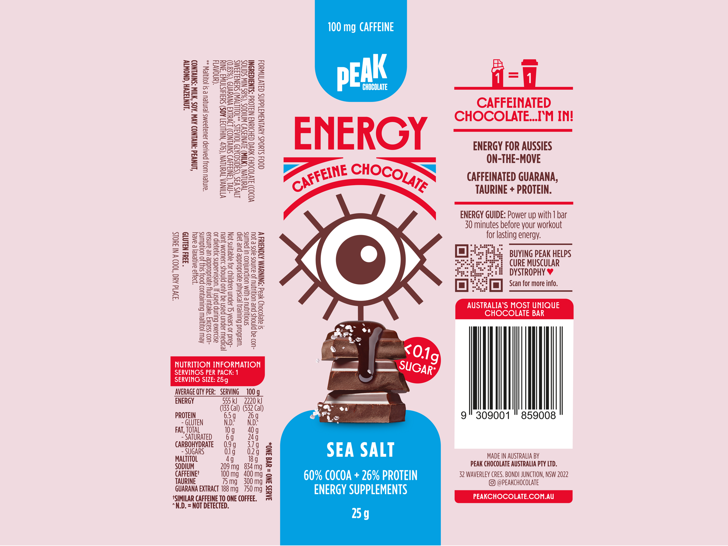
Peak Chocolate is a boutique functional chocolate brand based in Sydney, creating single-serve products that are extremely low in sugar with added supplementary benefits.
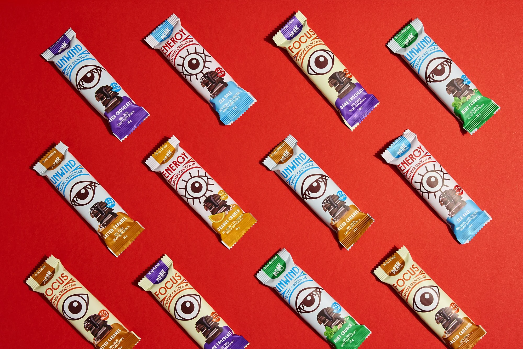
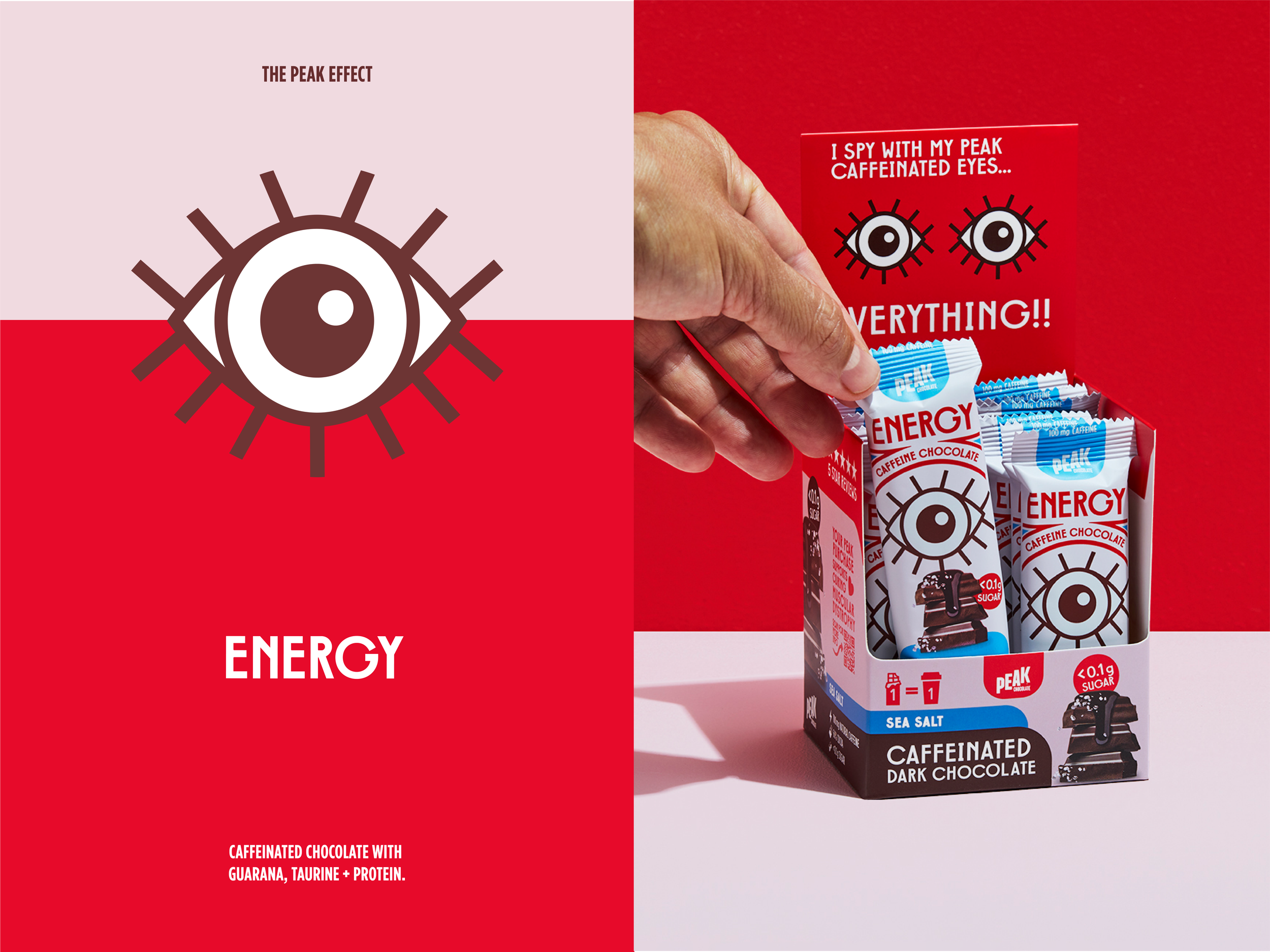
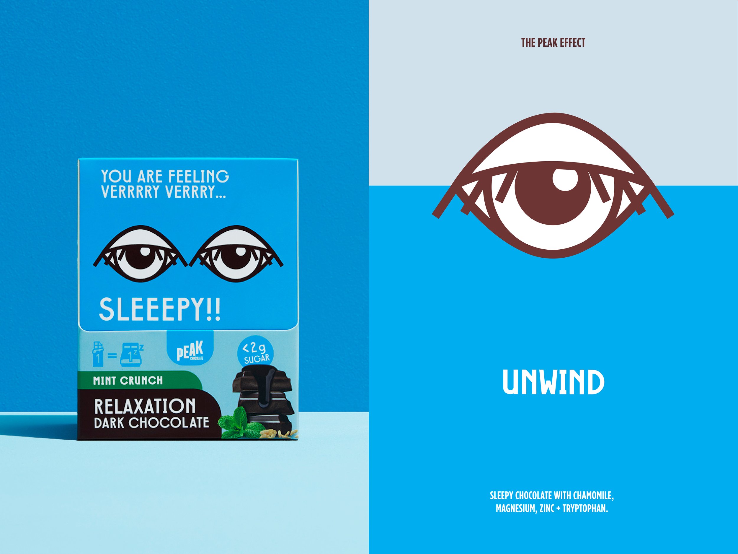
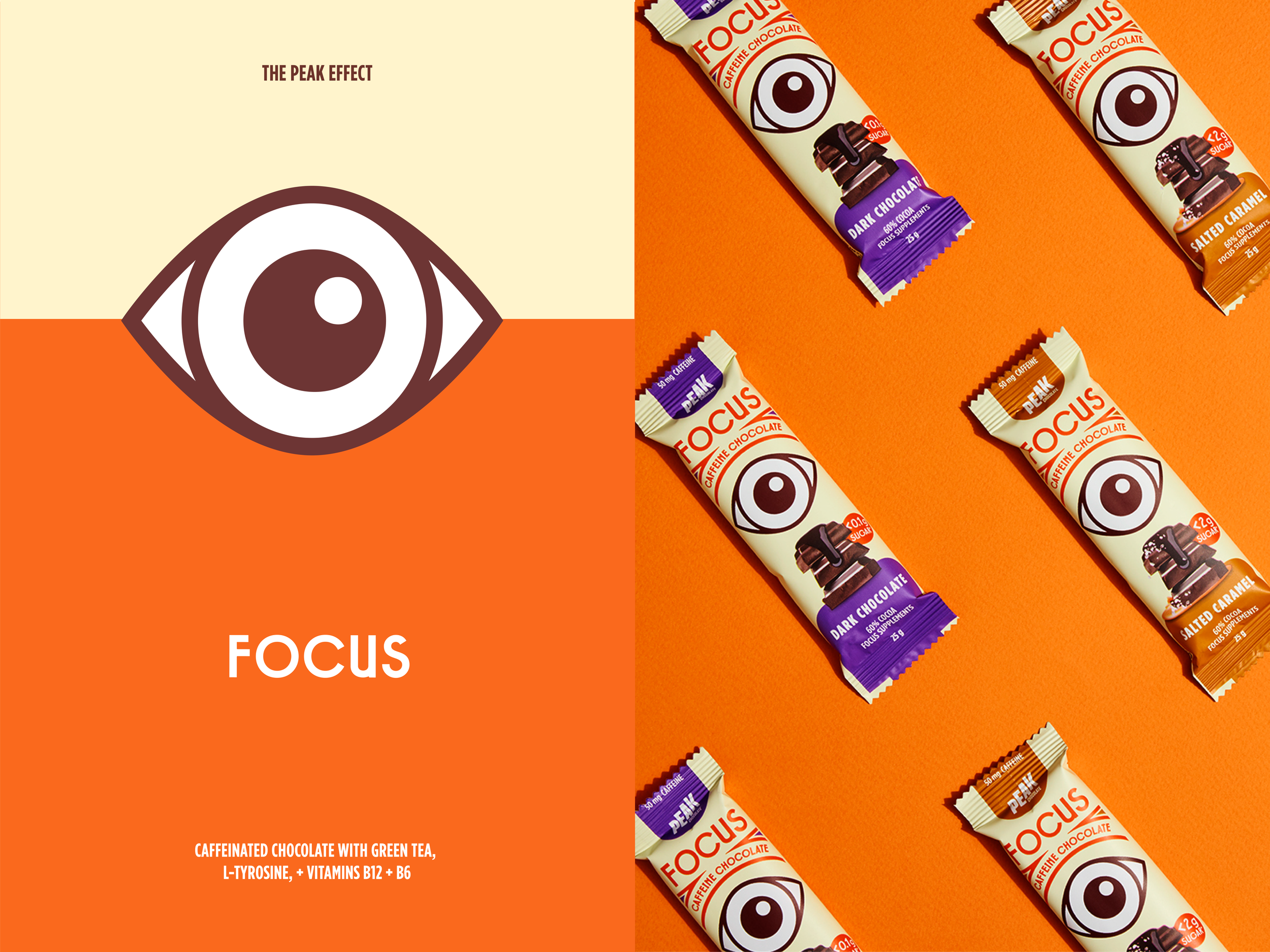
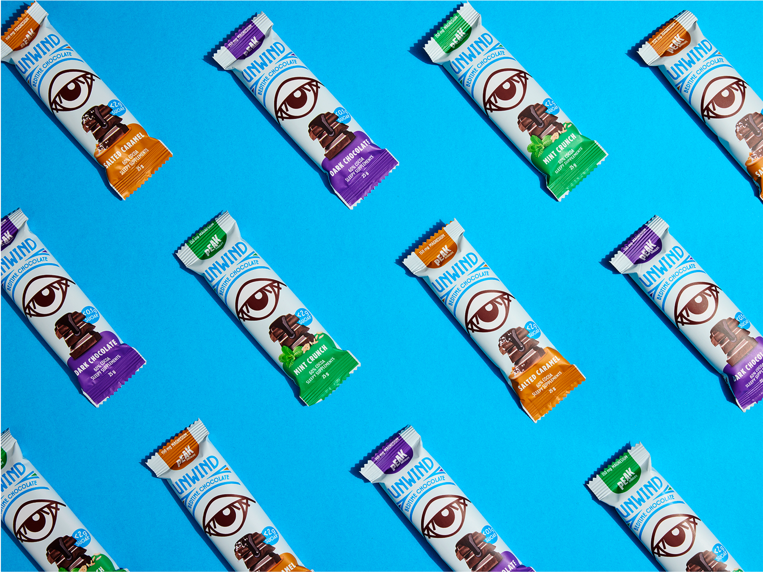
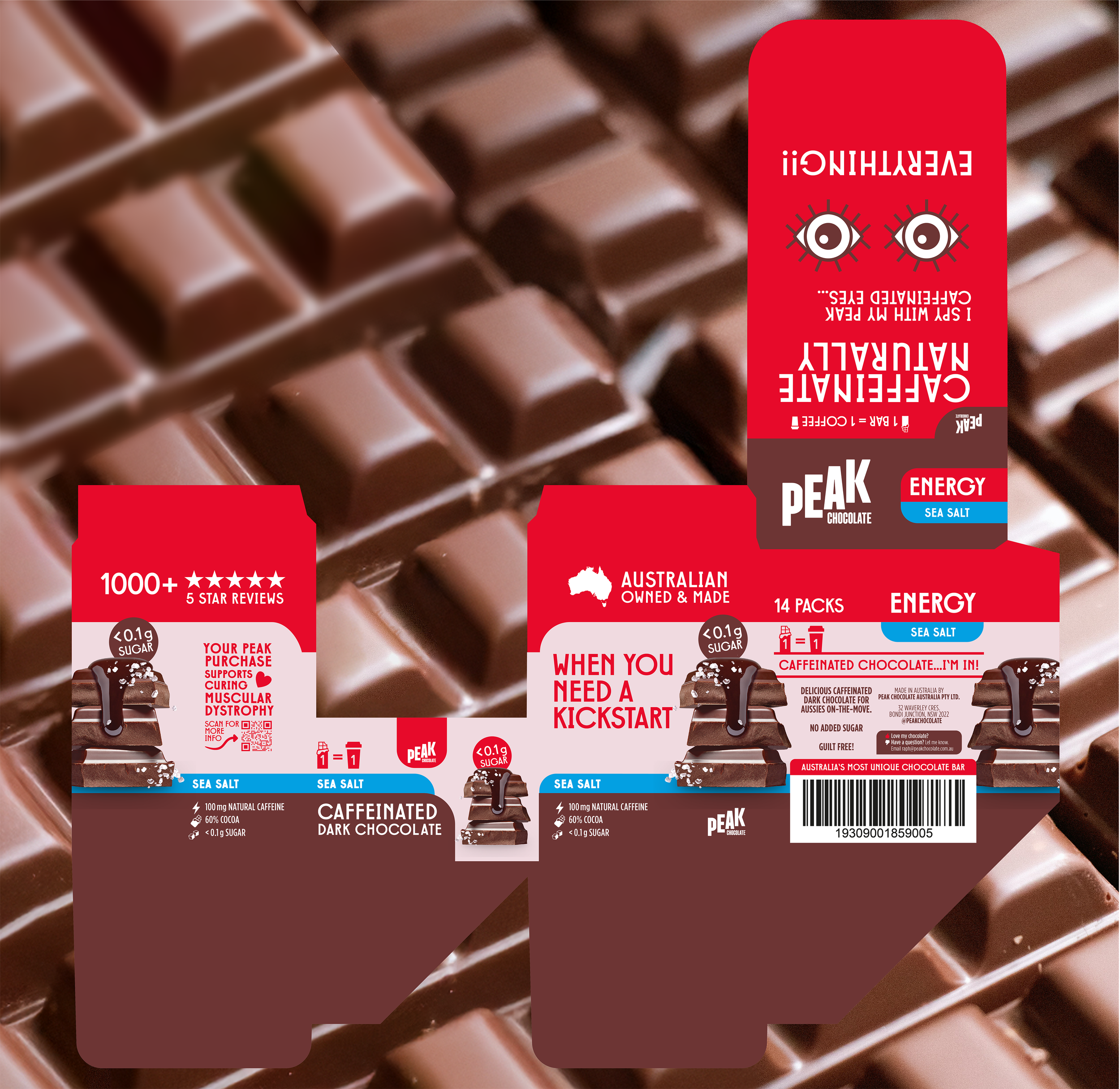
The brief was to re-design redesign their three existing products, each with distinct benefits, which had been sold predominantly online. The new design would establish the foundation for Peak Chocolate packaging and future products. The single-serve bars became a new slimmer, taller format with new flavours added to each product type. These new products were destined for supermarkets and boutique food stores.
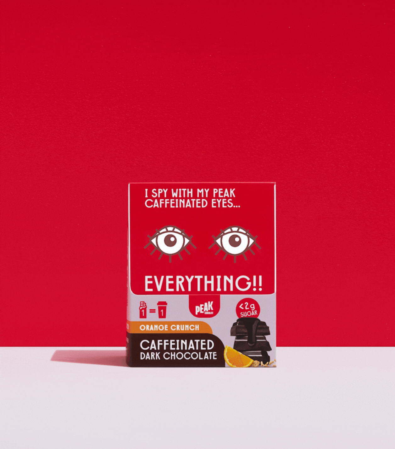
The goal was to design packaging that communicated the function of each bar simply, with maximum memorability. Shelf standout was important with an already saturated functional wellness category. I was briefed to avoid traditional 'earthy' health cues and create something fun and desirable—a product that felt like a treat while still delivering real functional benefits.
OCT 2023 – OCT 2024
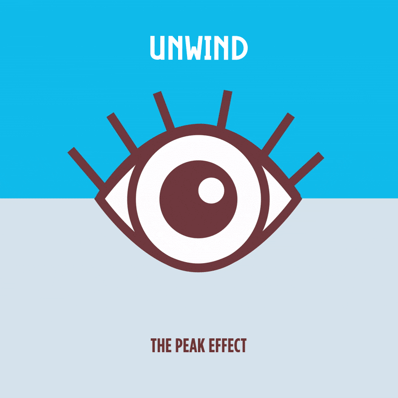
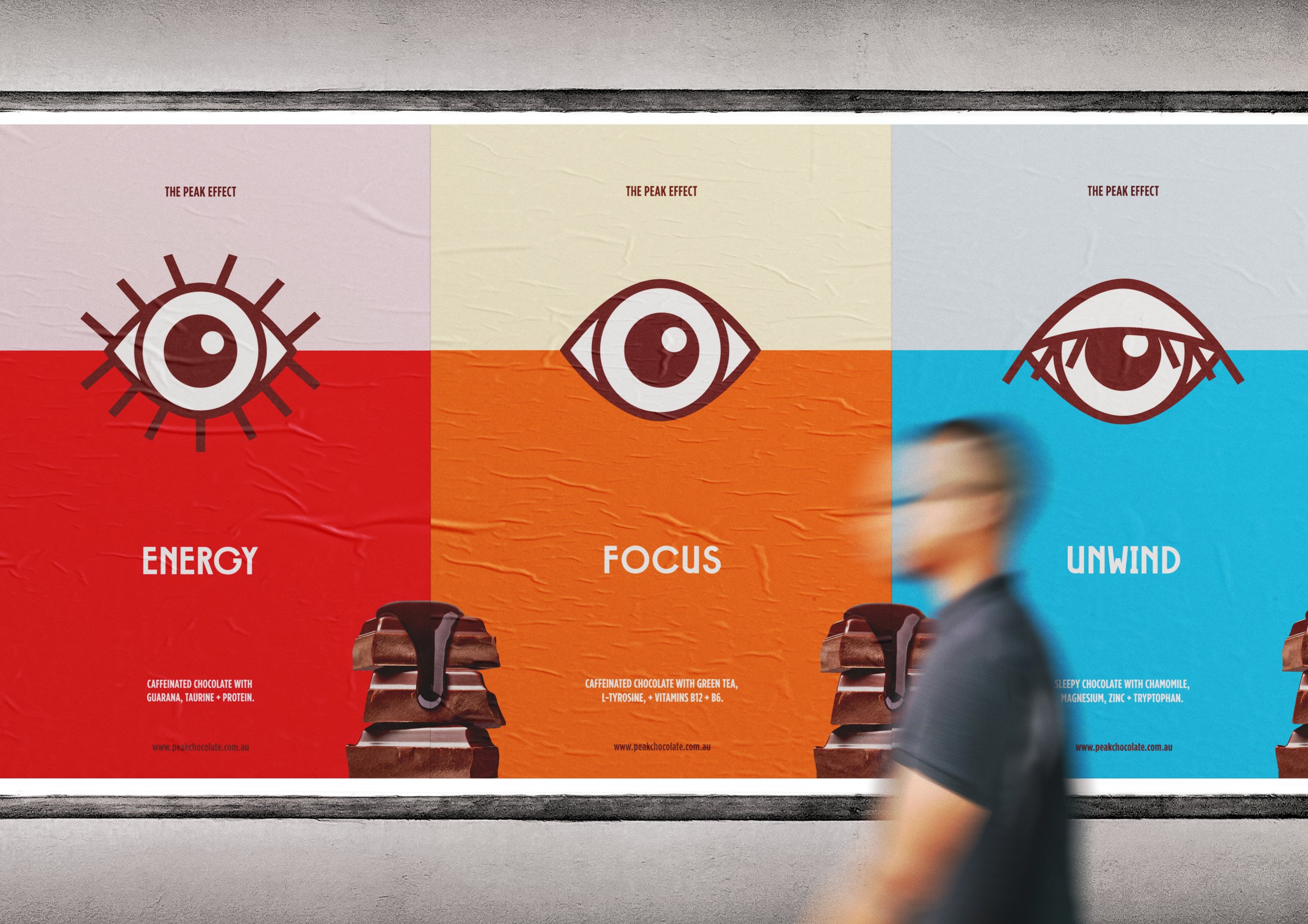
THE CONCEPT
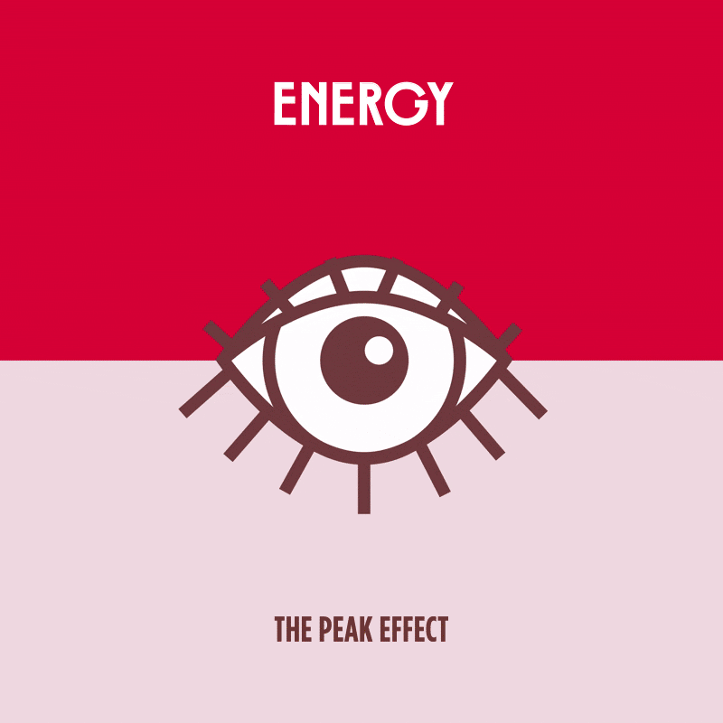
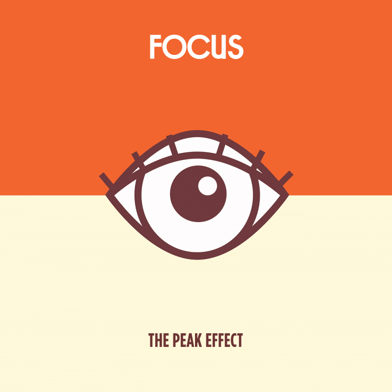
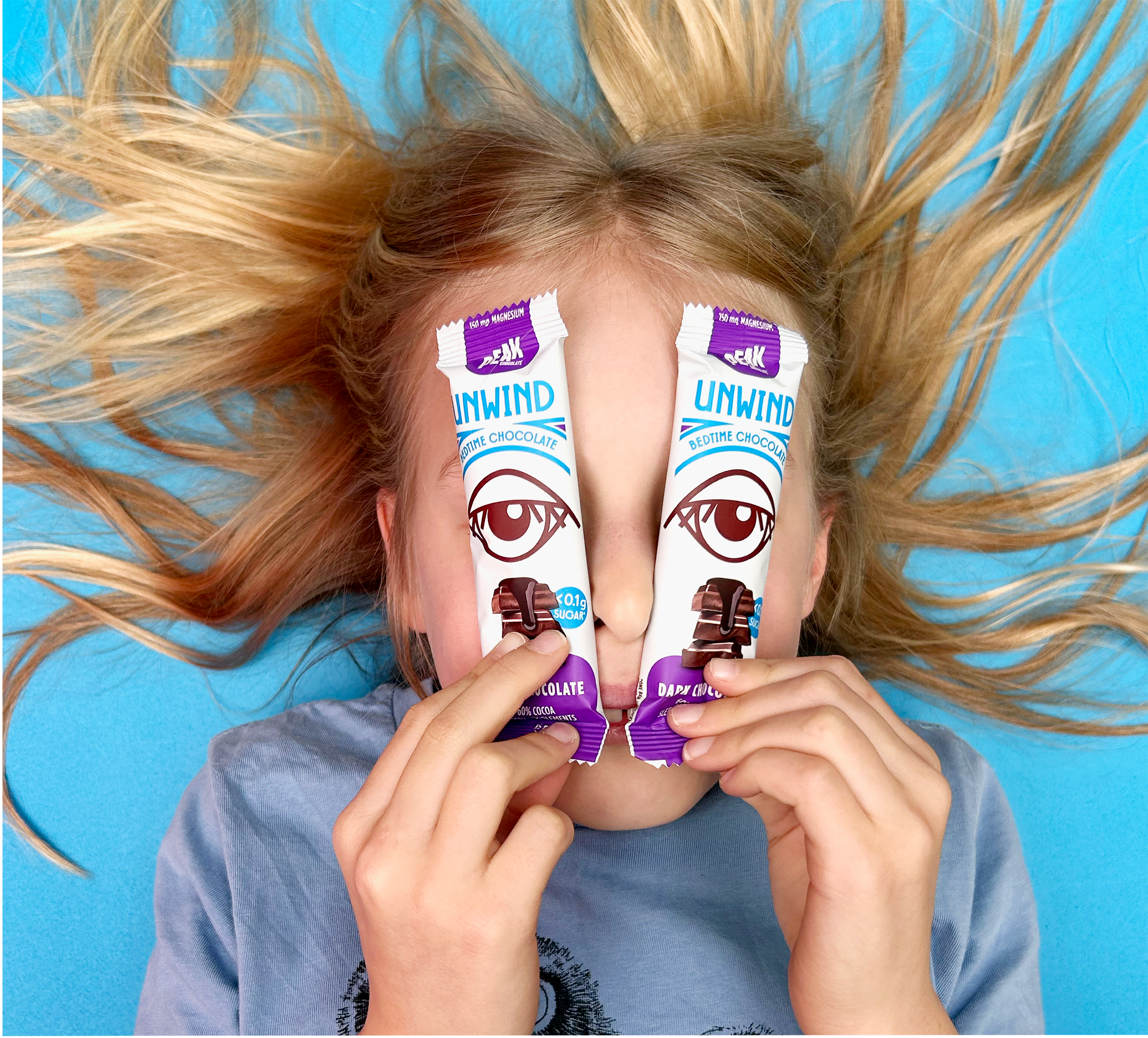
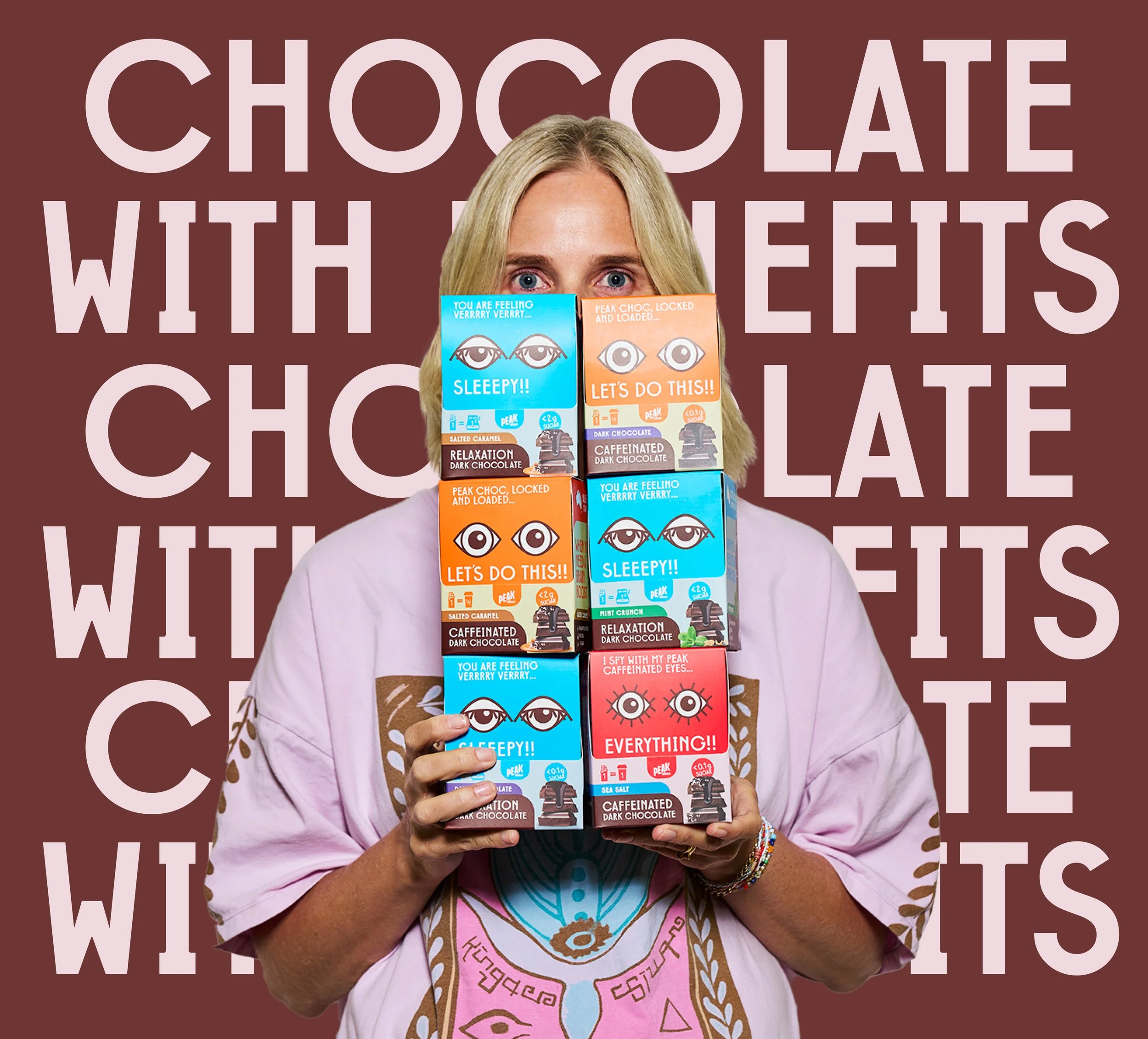
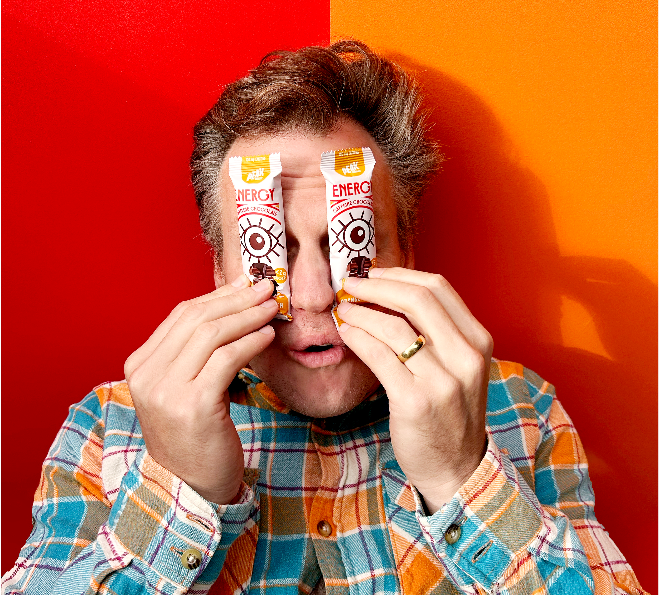
The final concept used bright colours and three graphic eye illustrations to instantly demonstrate each product's effect, a universally relatable visual. This eye concept offered significant range, from consumers engaging with the eyes on packaging to animated versions of the eye with the ‘Peak Effect’ for social media.


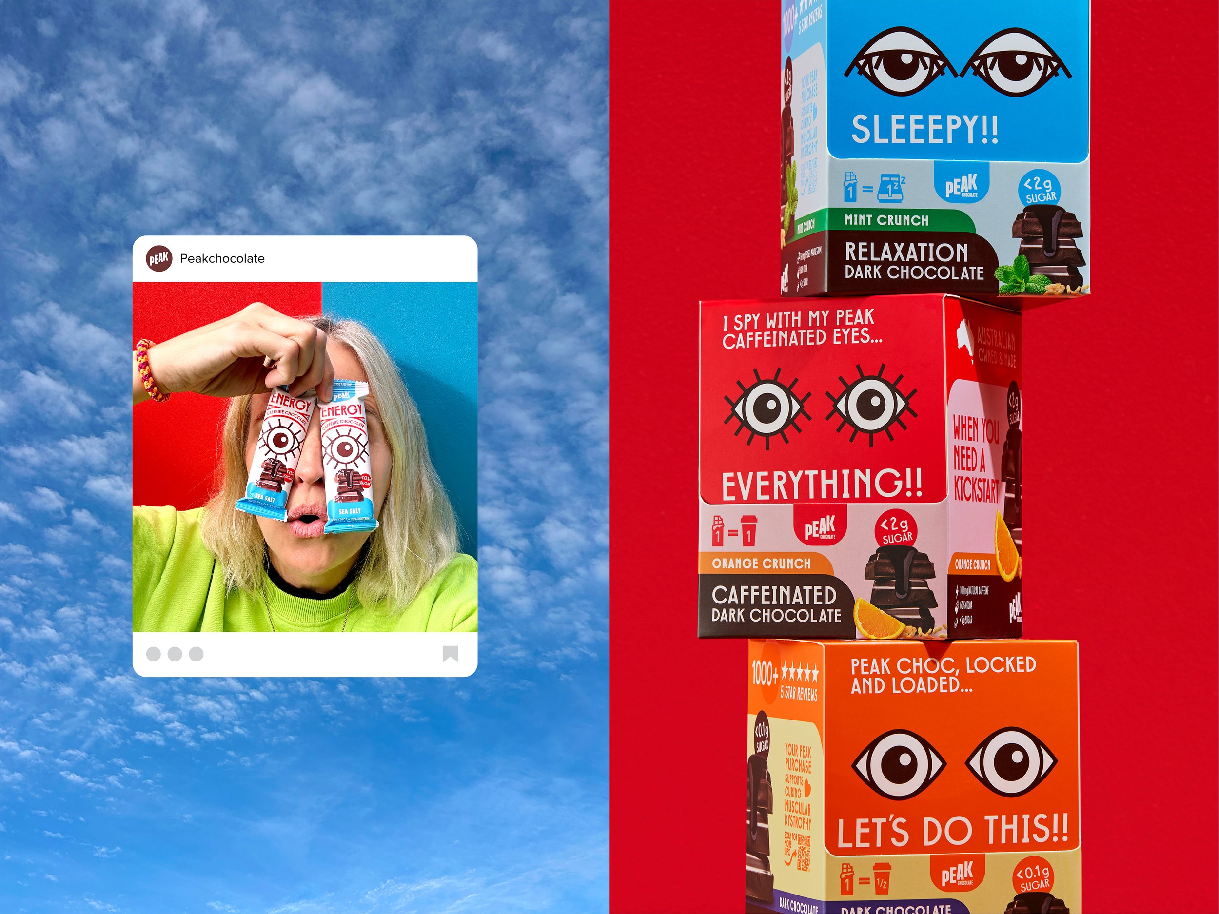


LOOK AT ME!
The eyes on pack become a fun activation within social content.
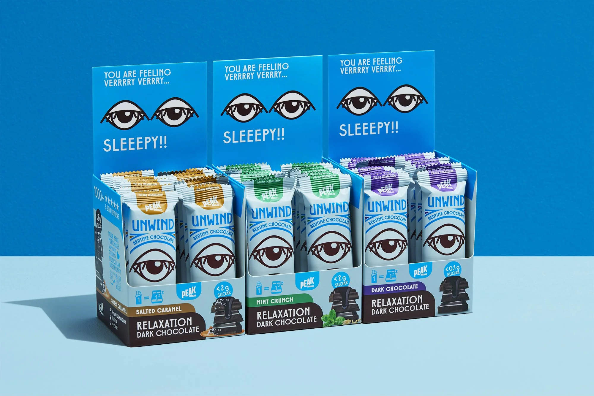
Shelf standout was amplified through shipper boxes that held two bars side by side, creating the impression of two eyes 'peering' at browsing consumers.


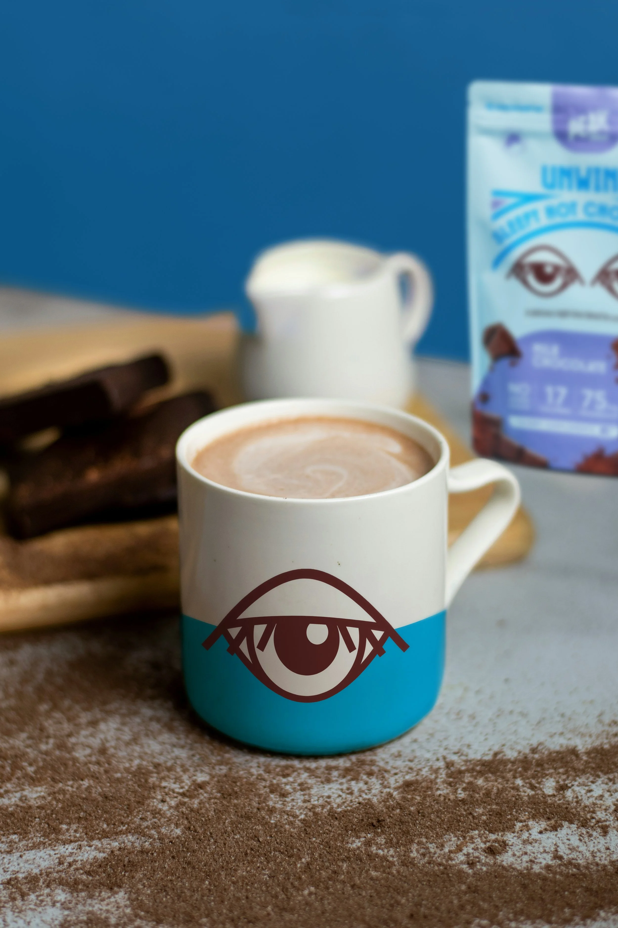
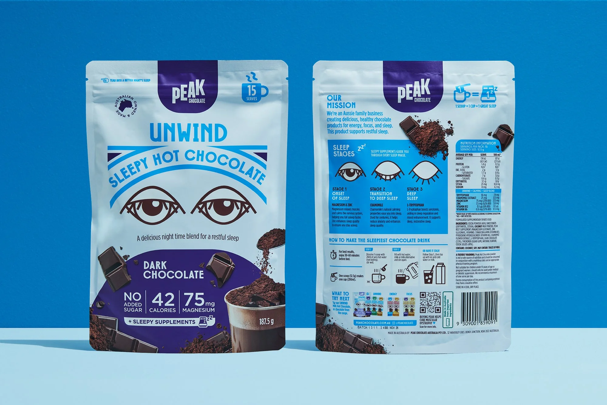
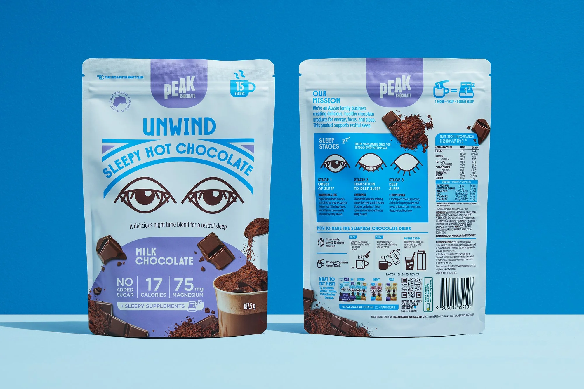
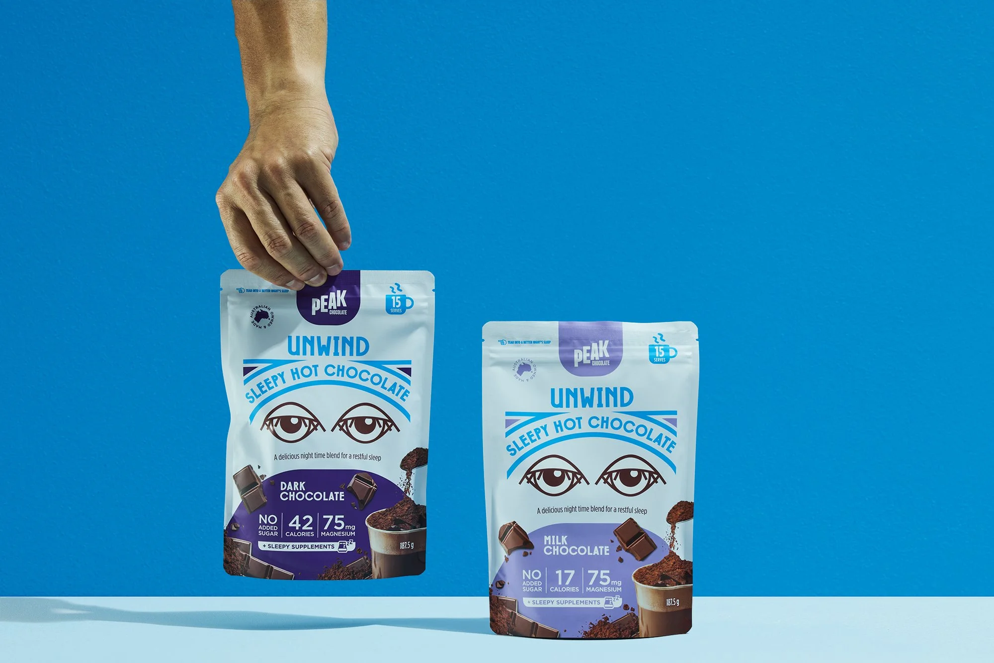
HOT CHOCOLATE
The eye graphics were so popular, they became embedded into the Peak brand itself. They were used across their hot chocolate range, for maximum memorability, standout and consistency within the brand.

“Amanda led our full packaging redesign from scratch for Peak and absolutely nailed it. She gave us bold, original concepts, iterated fast, and helped us create a DESIGN AND LOOK that seriously lifted our shelf presence and online conversions. Sales jumped, and stayed higher. Couldn’t recommend her more.”
RAPH FREEDMAN - PEAK CHOCOLATE OWNER