BRAINSHAPE
+ Visual identity
+ Illustration
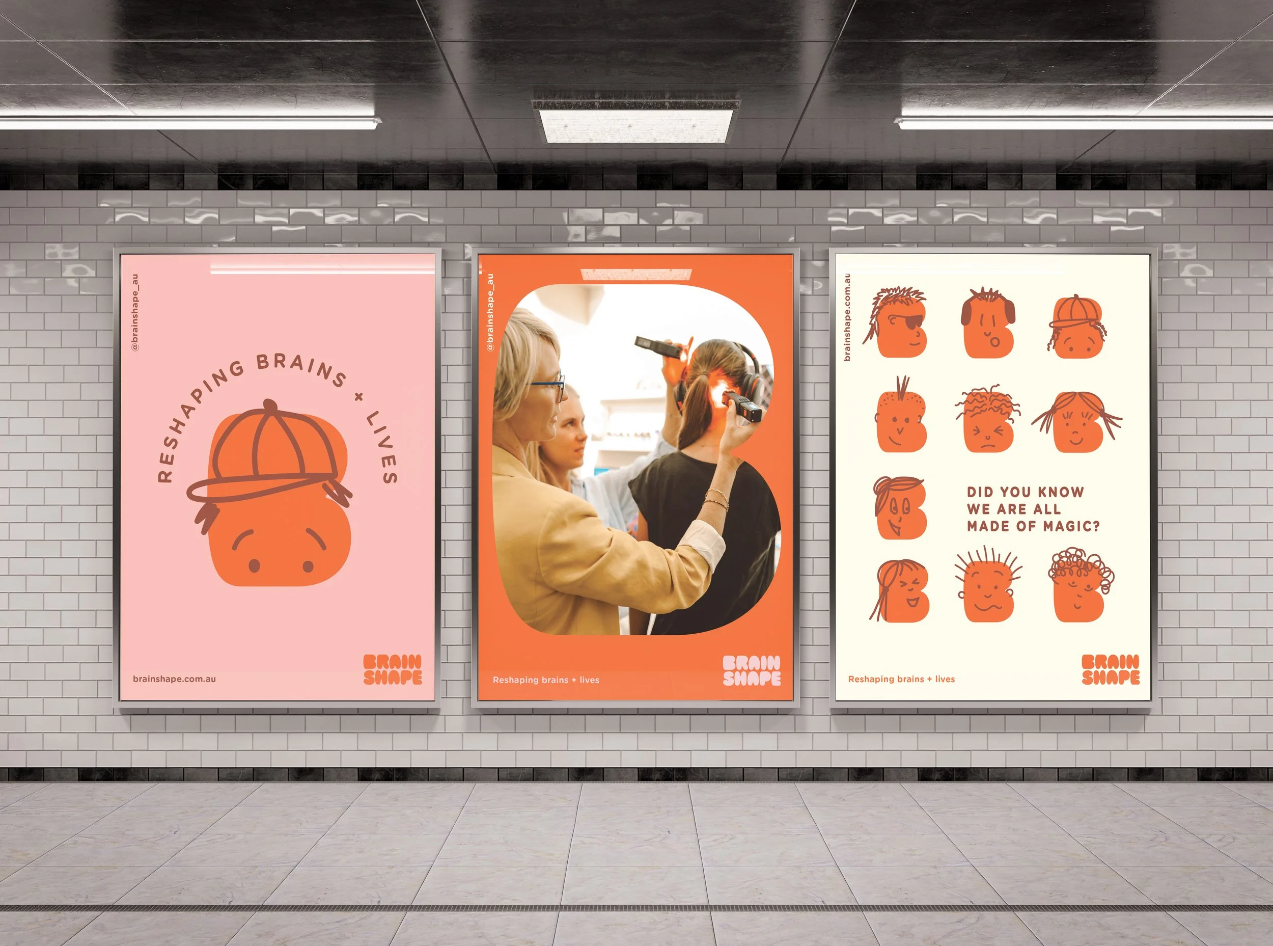
+ Signage
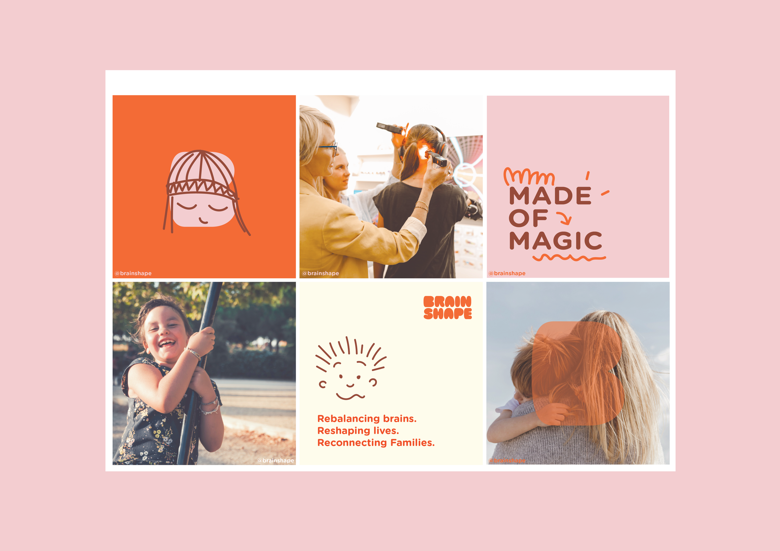
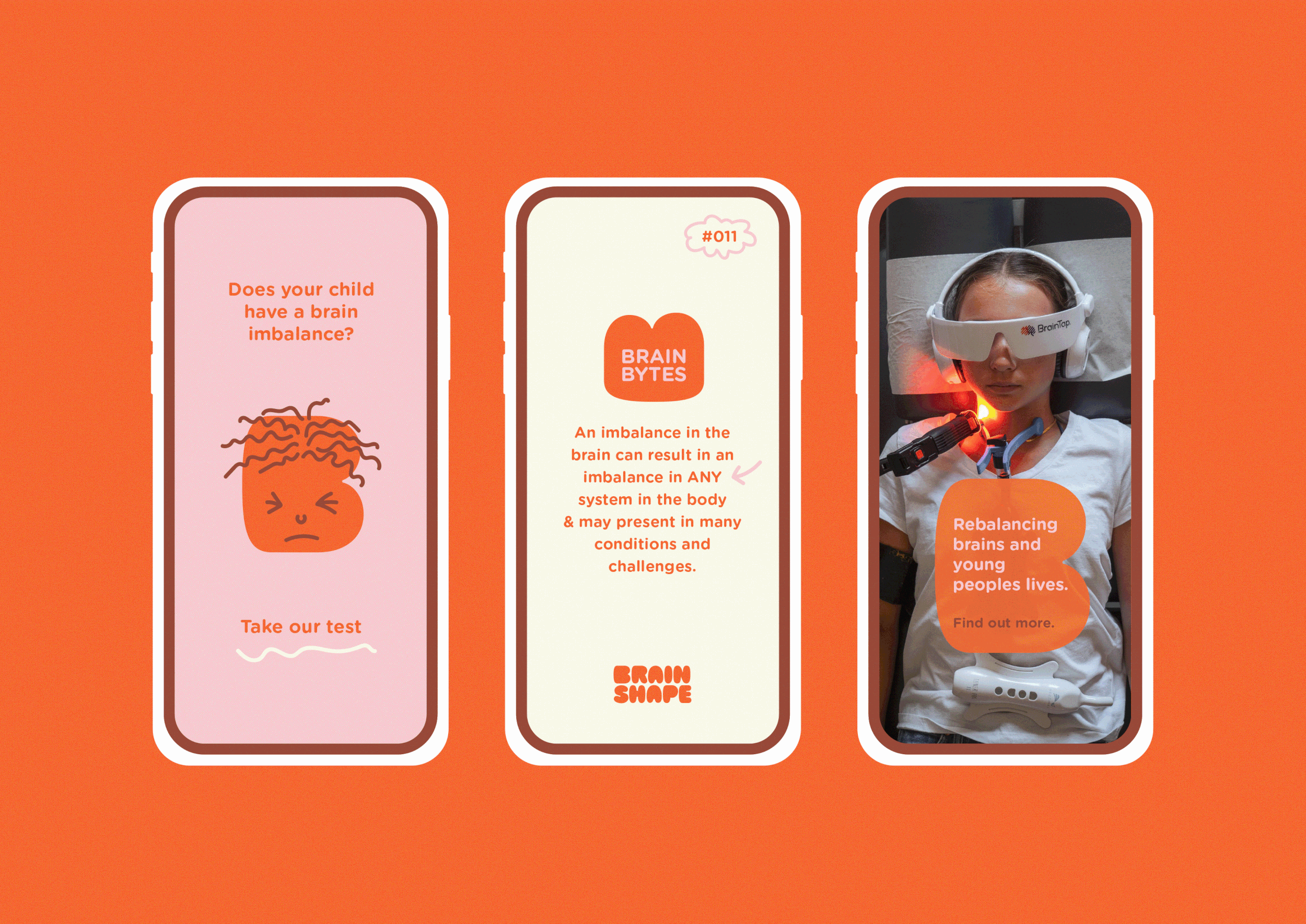
+ Social media templates
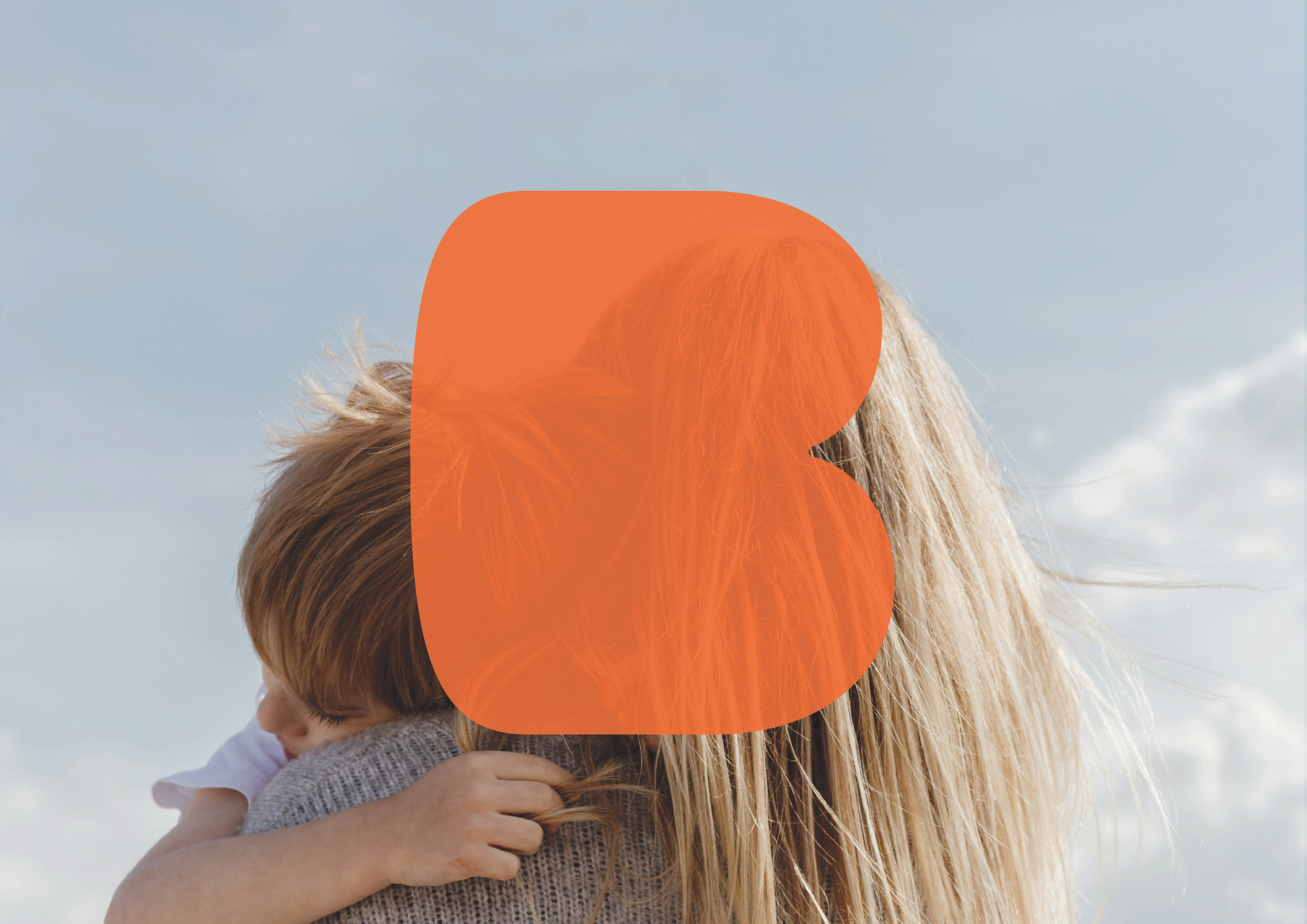
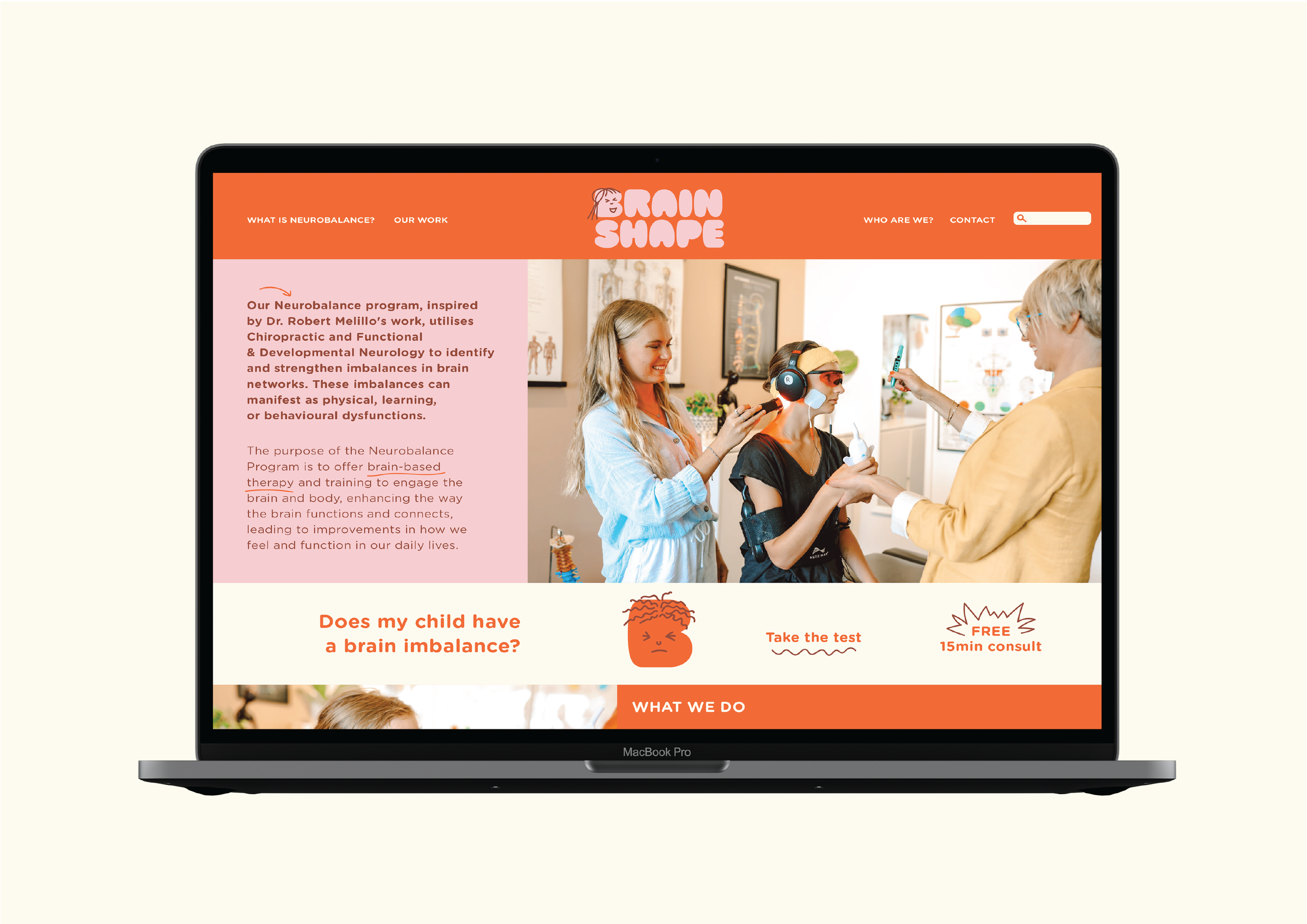
I had the opportunity to create a brand identity for the amazing Dr Zoe Braund and her revolutionary business, Brain Shape. Based in Sydney, Brain Shape is helping families and children with brain imbalances. Their personalised approach blending the very best of functional neuro-science, sensory-motor rehabilitation and nutrition is transforming children’s lives by retraining and rewiring their neural pathways.
It's about the child who finally feels understood, the parent who rediscovers hope and the family reconnecting in ways they feared lost…because all children are made of magic.
JUL 2025
THE CONCEPT
This brand identity needed to capture the clinic's playful, warm and nurturing atmosphere, while simultaneously establishing a sense of confidence and trustworthiness.
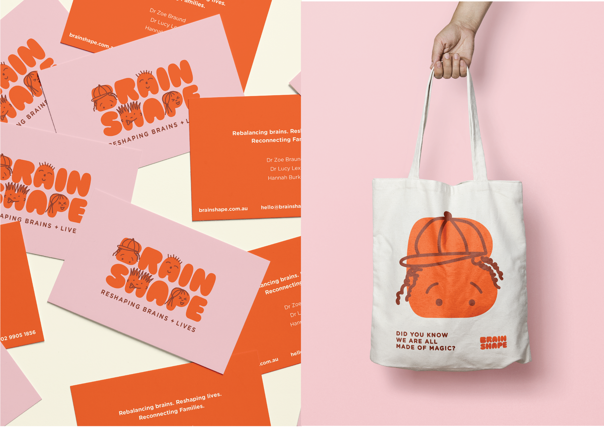
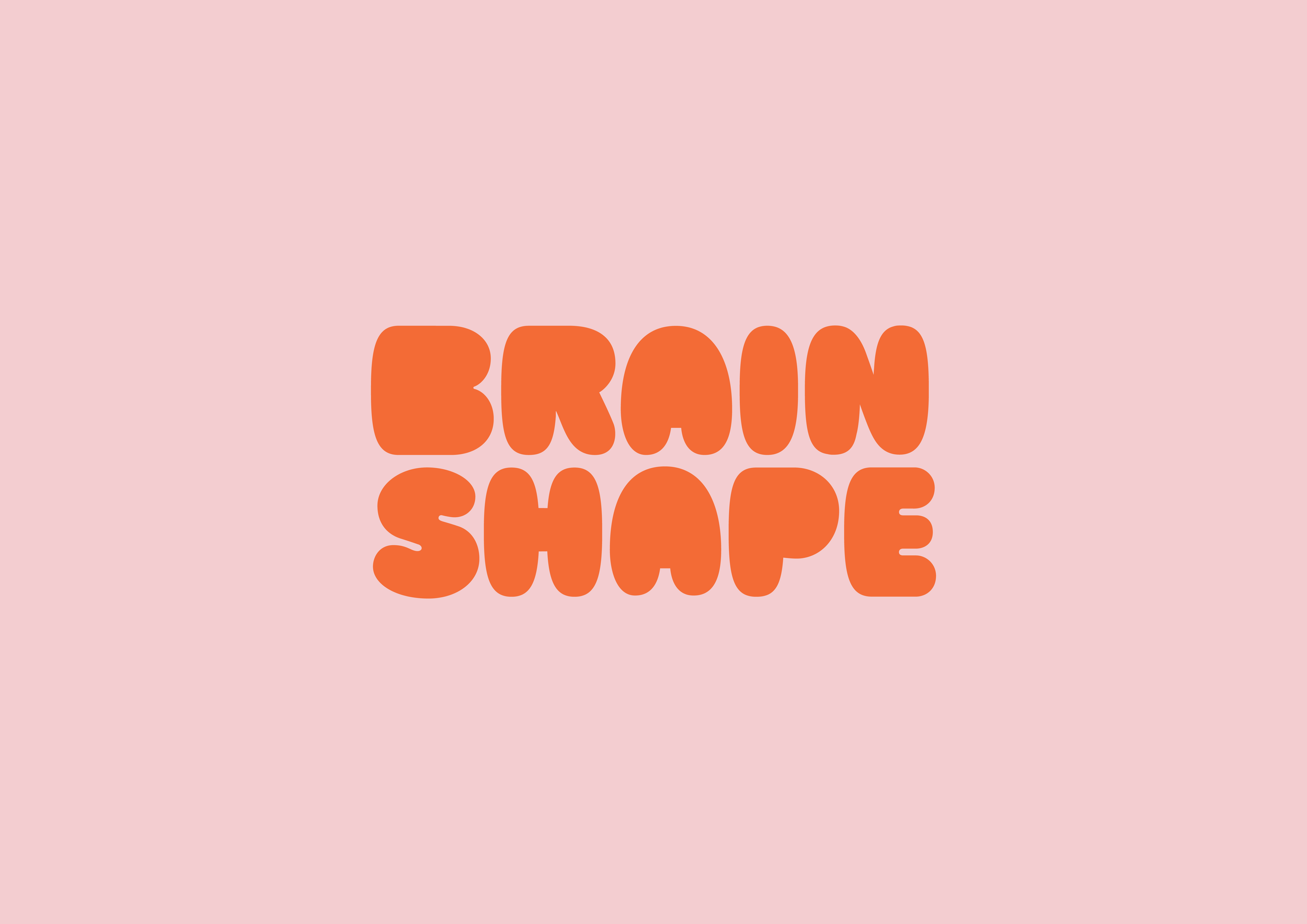
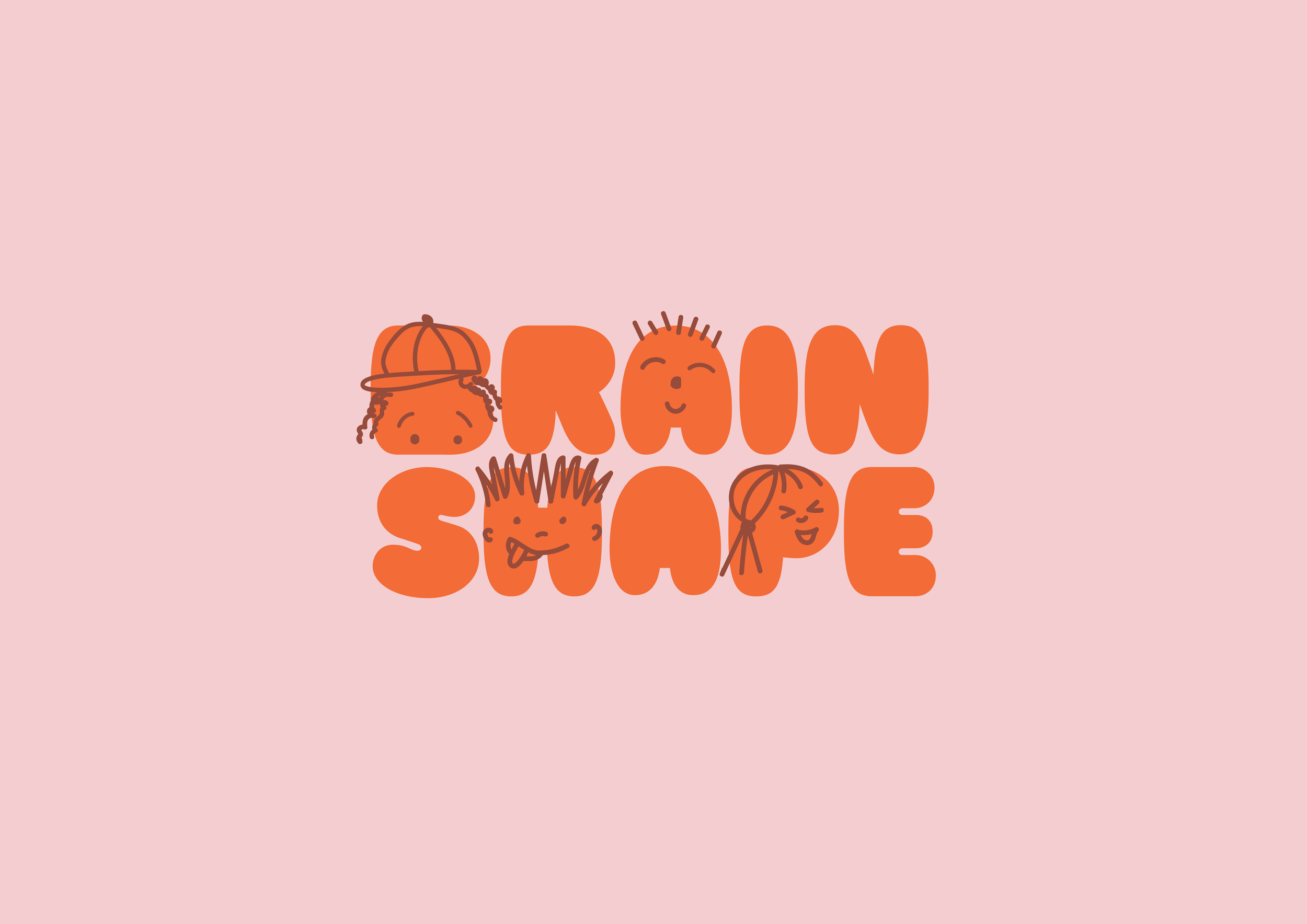
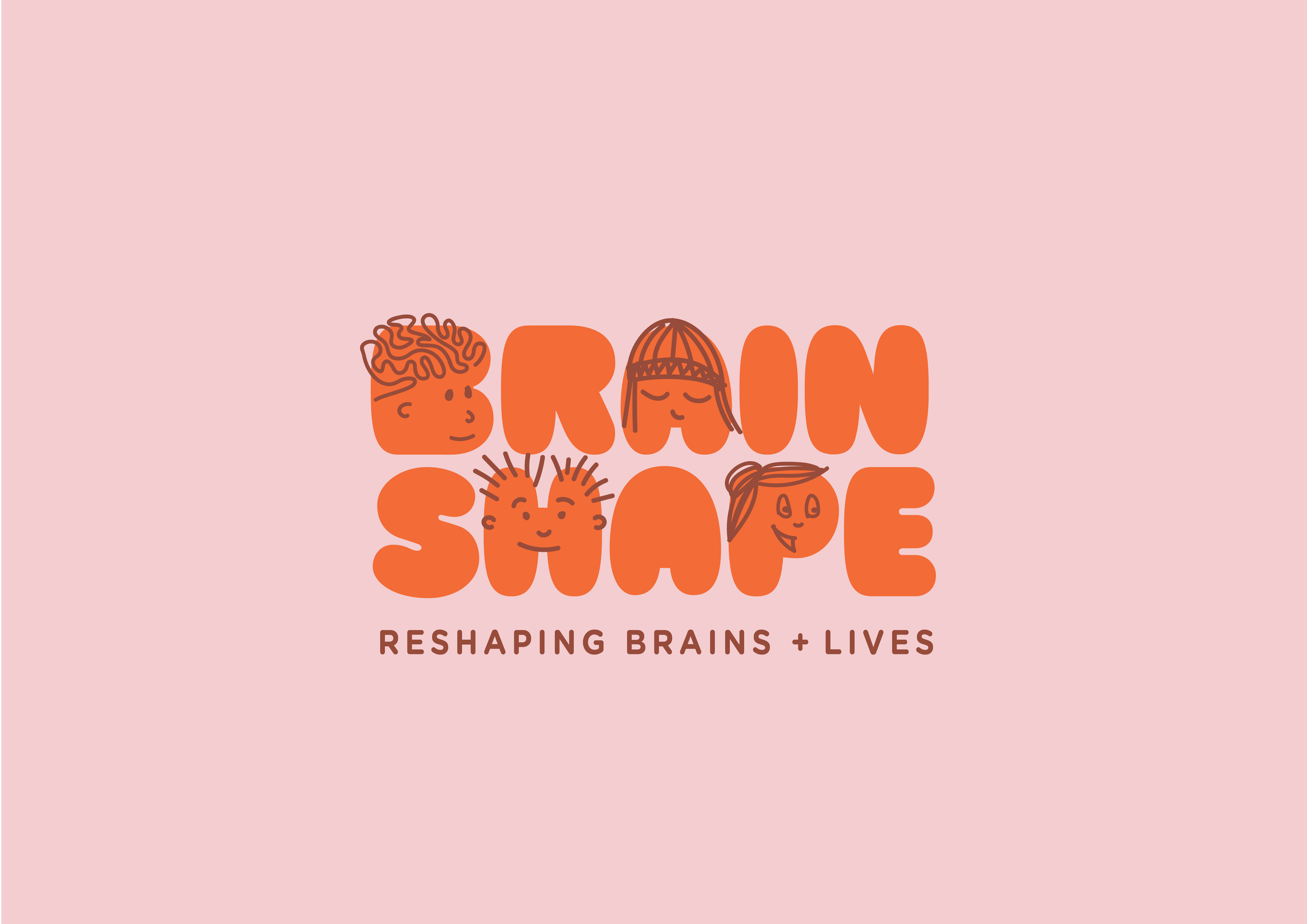
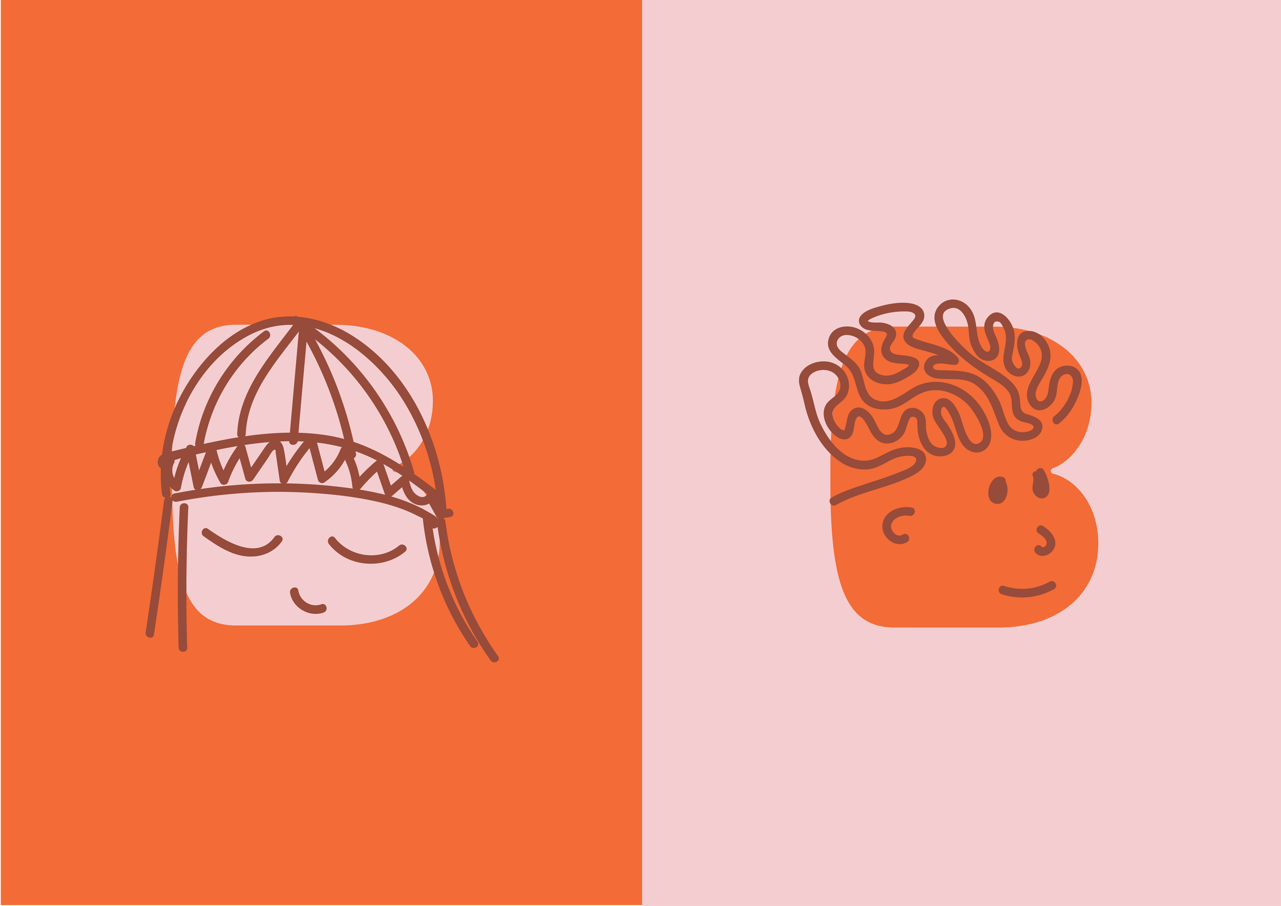
The playful, ‘bubble’ styled typography is friendly, young and gives the idea of movement, growth and malleability. Little illustrated faces added the playful element and represent all the children who find their smiles with Brainshape’s help.
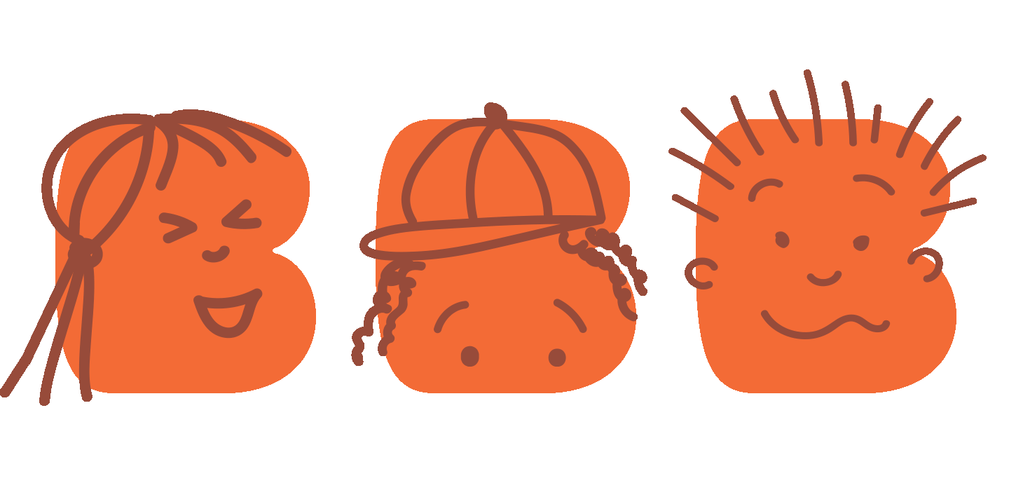
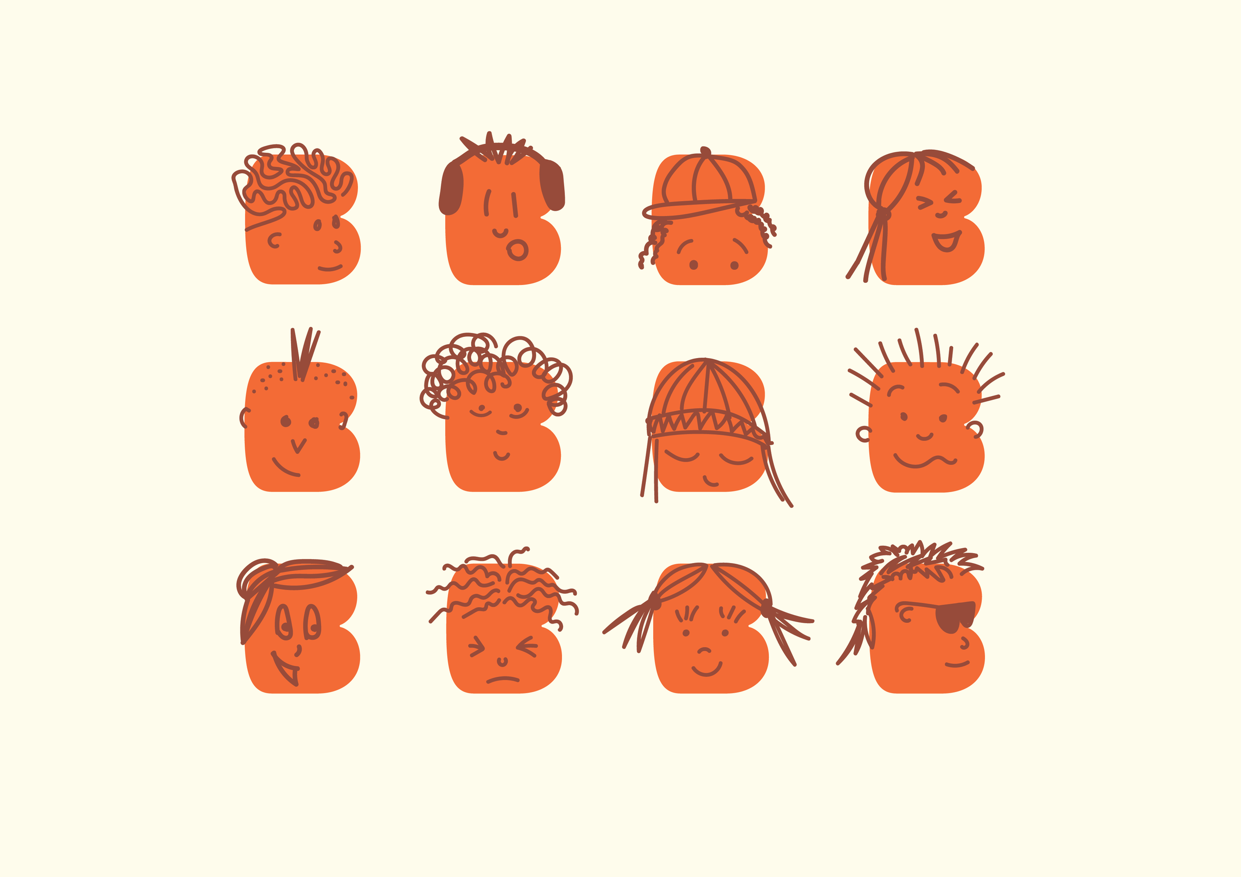
‘B’ SERIES
These little quirky illustrated faces are used across a series of letter ‘B’s, creating a catalogue of branded assets for Brainshape to use across all their collateral, signage and workbooks. A ‘master’ B with a little brain sketch and smile, was created to use as a more general branded symbol.
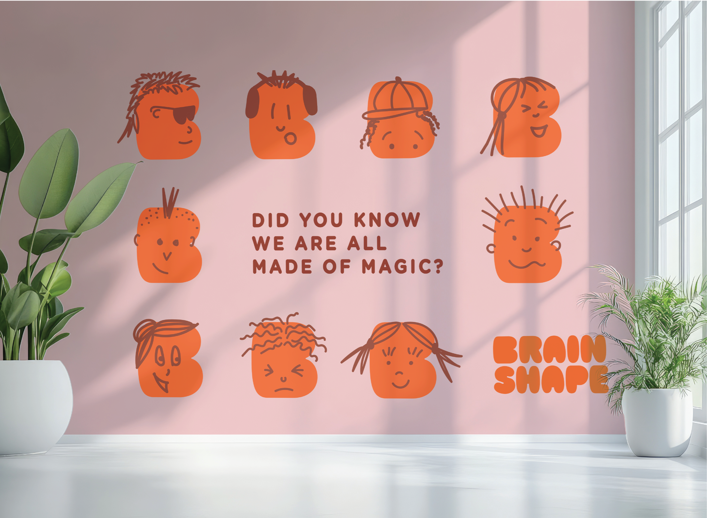
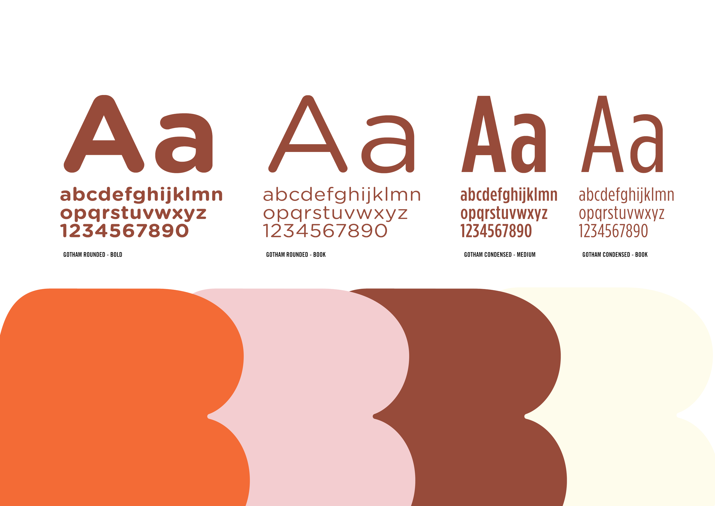
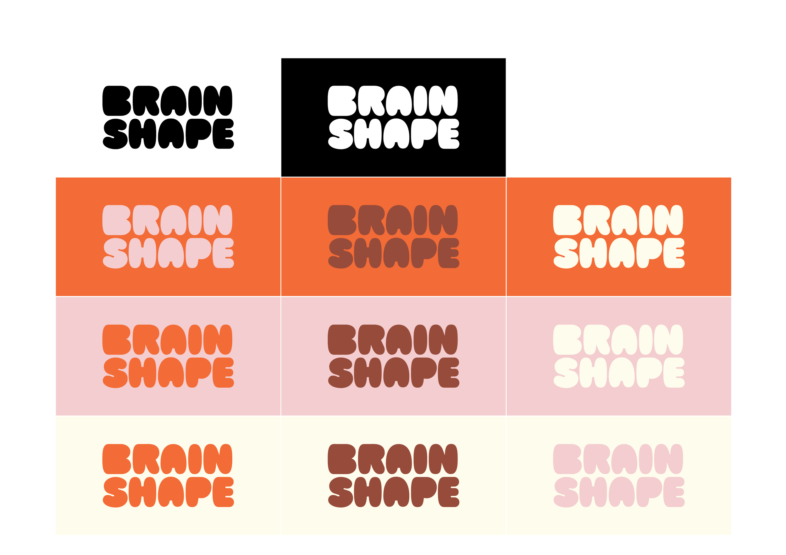
The colour palette is bold and fun, built around two standout colours – a punchy orangey-red and a soft pale pink. These two colours do most of the heavy lifting in the branding, providing it with warmth and vibrancy, while a chocolate brown adds a bit of seriousness and depth. A warm cream serves as a neutral base, adding balance and creating a soothing undertone that grounds the more energetic colors. It's a playful mix that feels modern and contemporary.