CHRIS CRAWFORD PHOTOGRAPHY
+ Visual identity
Chris Crawford, a prominent name in commercial photography, brings a unique blend of creativity and technical expertise to his work.
I had the opportunity to rebrand Chris and showcase his unique offering of photographic experience along with his agency background in Art direction.
FEB 2023


THE CONCEPT
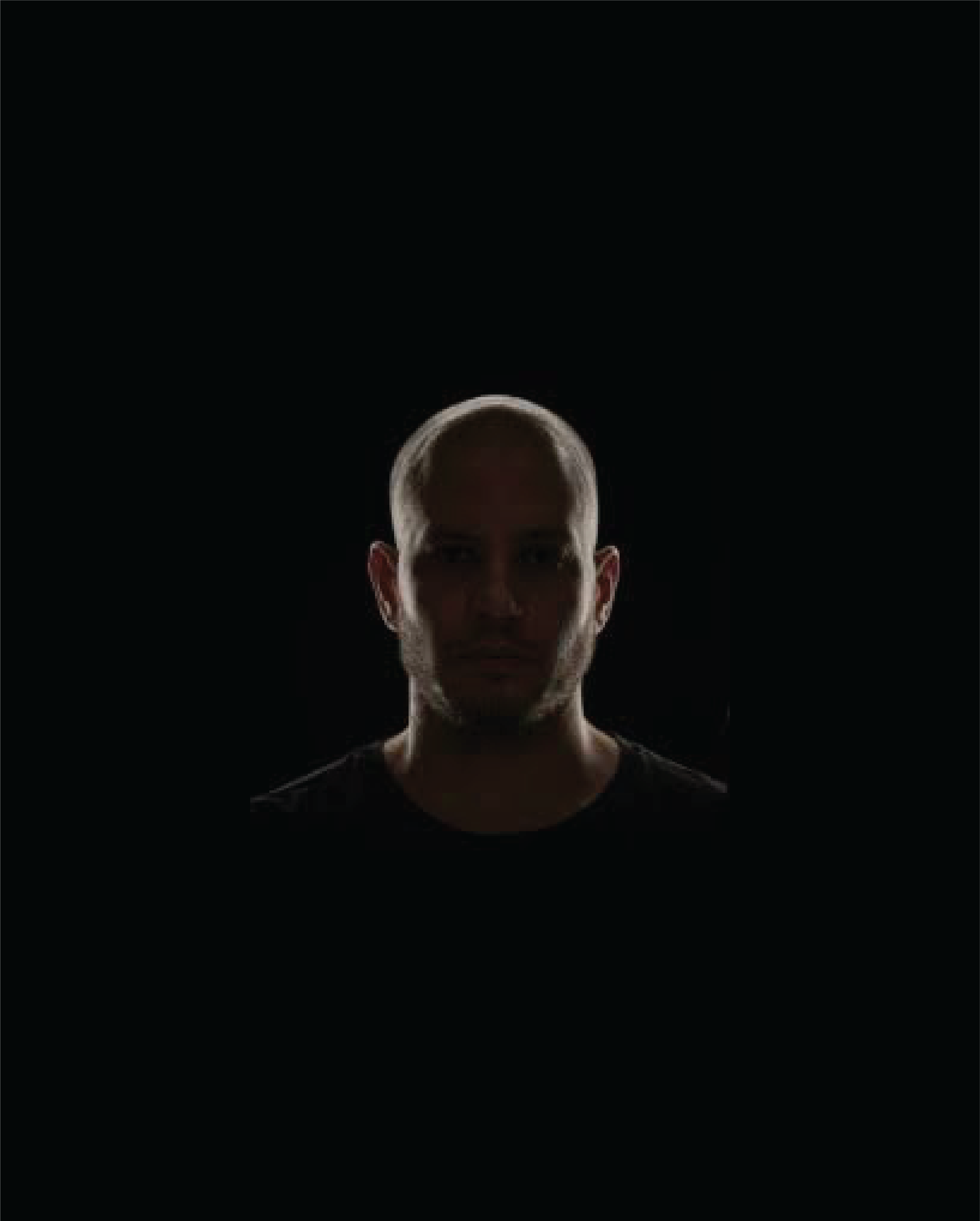
The word 'photography,' derived from the Greek language, translates to 'drawing with light', and with light there will always be shade. This fundamental relationship between light and shadow, and the concept of ‘drawing with light’ forms the foundation of this concept.
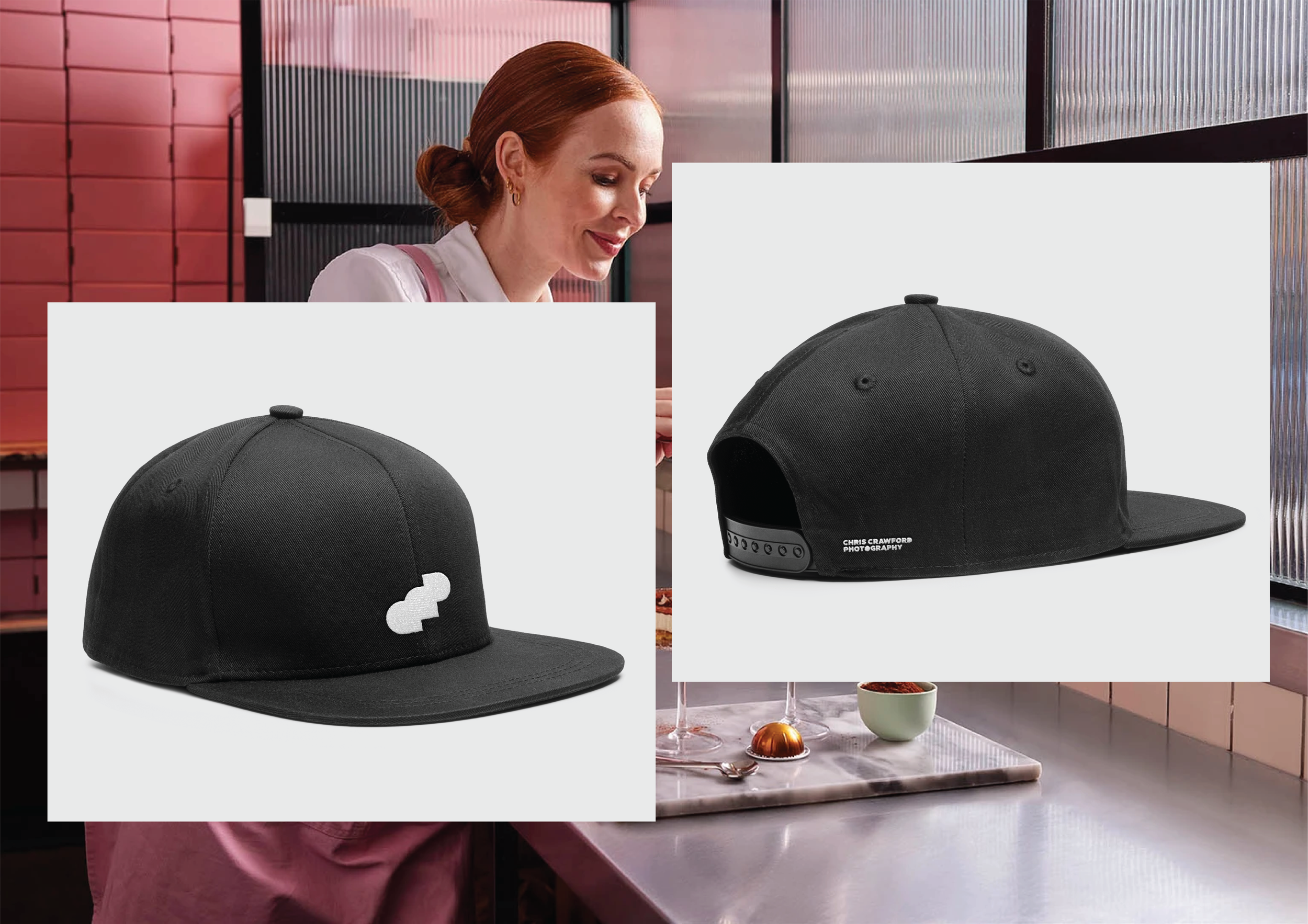
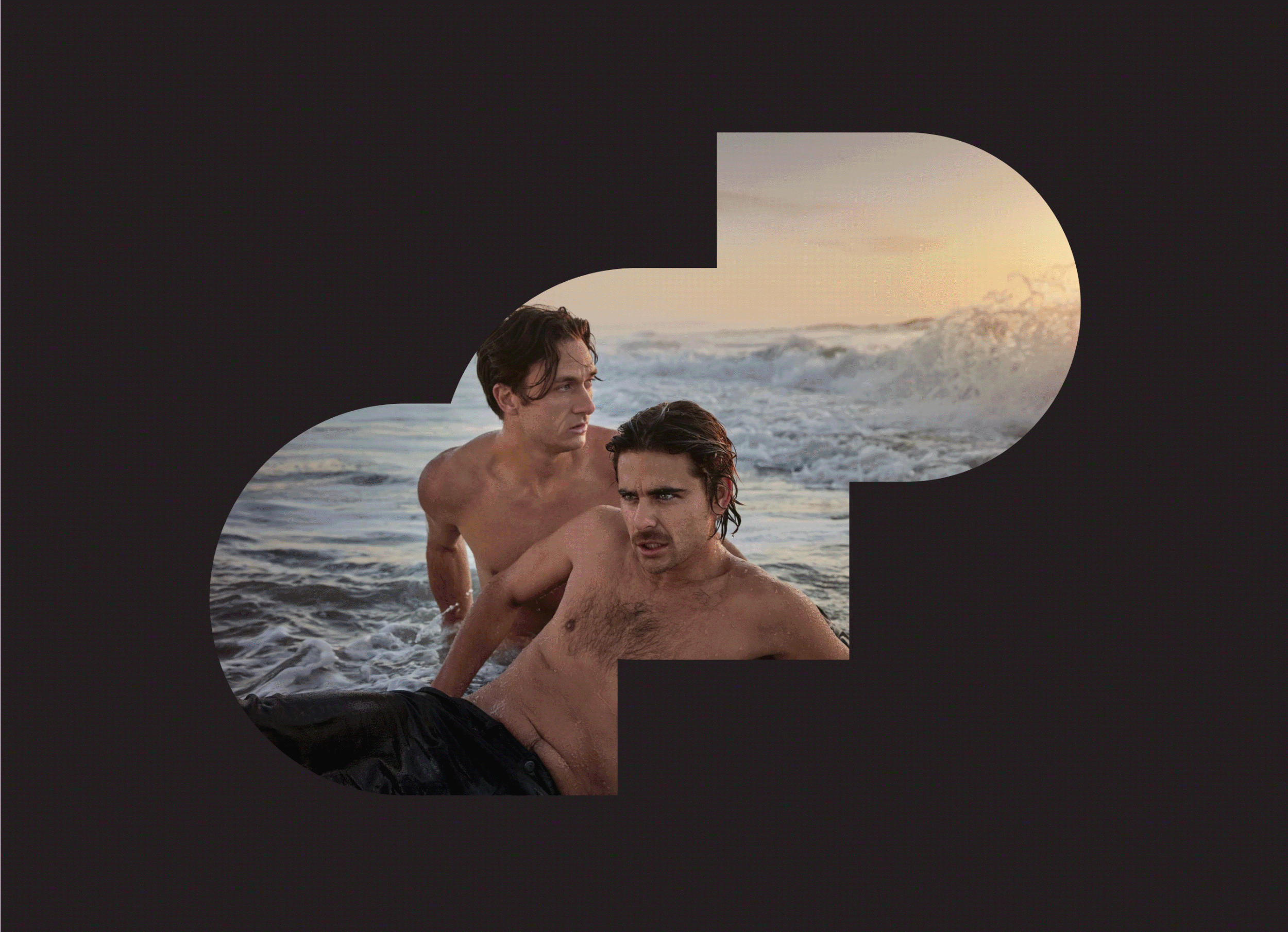
Bold, simplified geometric shapes join together to create an almost organic shape, or ‘drawing’. This shape serves dual purposes: it acts as a dynamic window for the imagery whilst also referencing the lettering ‘CCP’.

The brand mark’s ‘window’ can crop into contrasting photography or become an overlay showcasing Chris’s work and his diverse skillset.


A monochromatic palette was adopted to represent the light and shadow, and allow the photography to hero the identity and provide colour across the branding.