OLOTL
+ Brand Creation
+ Packaging Design
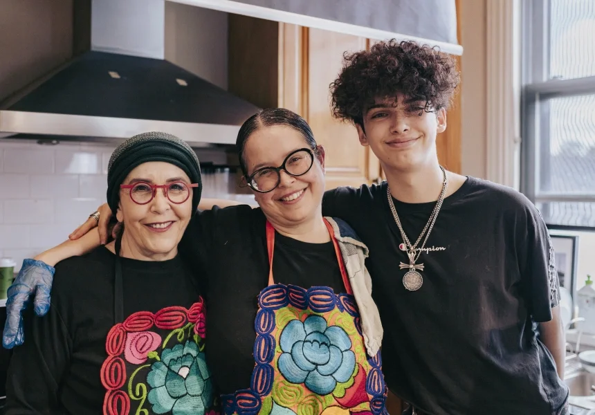
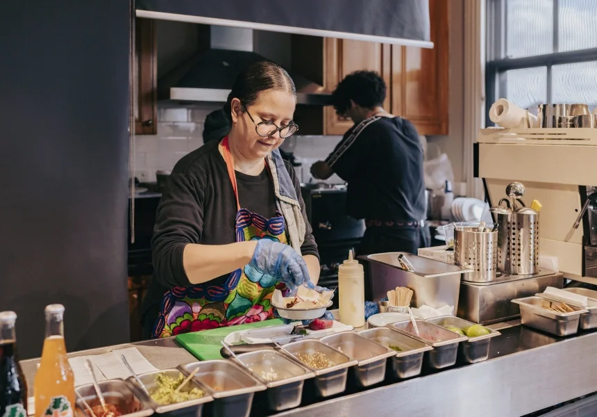
Olotl is the "heart of the corn" in Aztec, and the name of this heart filled, family-owned Mexican restaurant in Newtown, Sydney. Run by a mother and daughter duo, these two passionate women share not just a kitchen, but also a name. Blanca and Blanca are making waves with their traditional family recipes and earning praise from Sydney's critics.
Through my involvement with the Brandkind community, I had the opportunity to work with Olotl via Foodlab Sydney. They already had a logo, but needed a distinctive brand to represent the quality of their offering and share their unique story. A branded style was created using the logo's modern graphic type for inspiration. Their story then told through some simple cost effective food packaging.
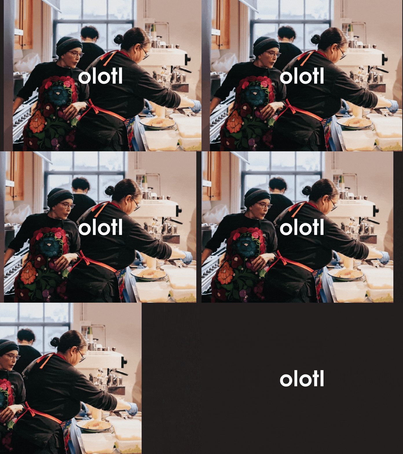
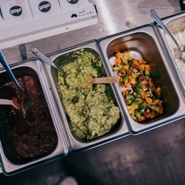
Photo credit: Yusuke Oba (Courtesy of broadsheet.com.au)
MAR 2025


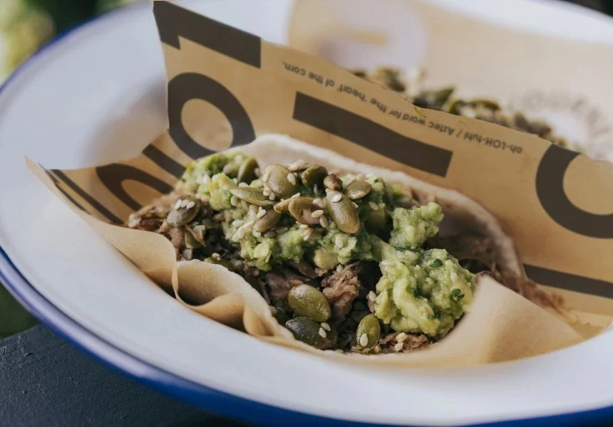
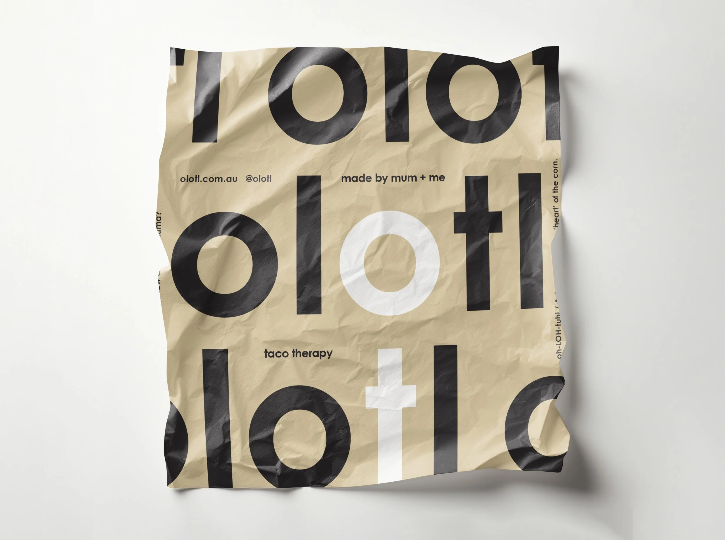
Two wax paper designs were created to wrap Olotl’s famous tacos. The logo’s simple modern letterforms used at scale became the foundation for the wider brand style.
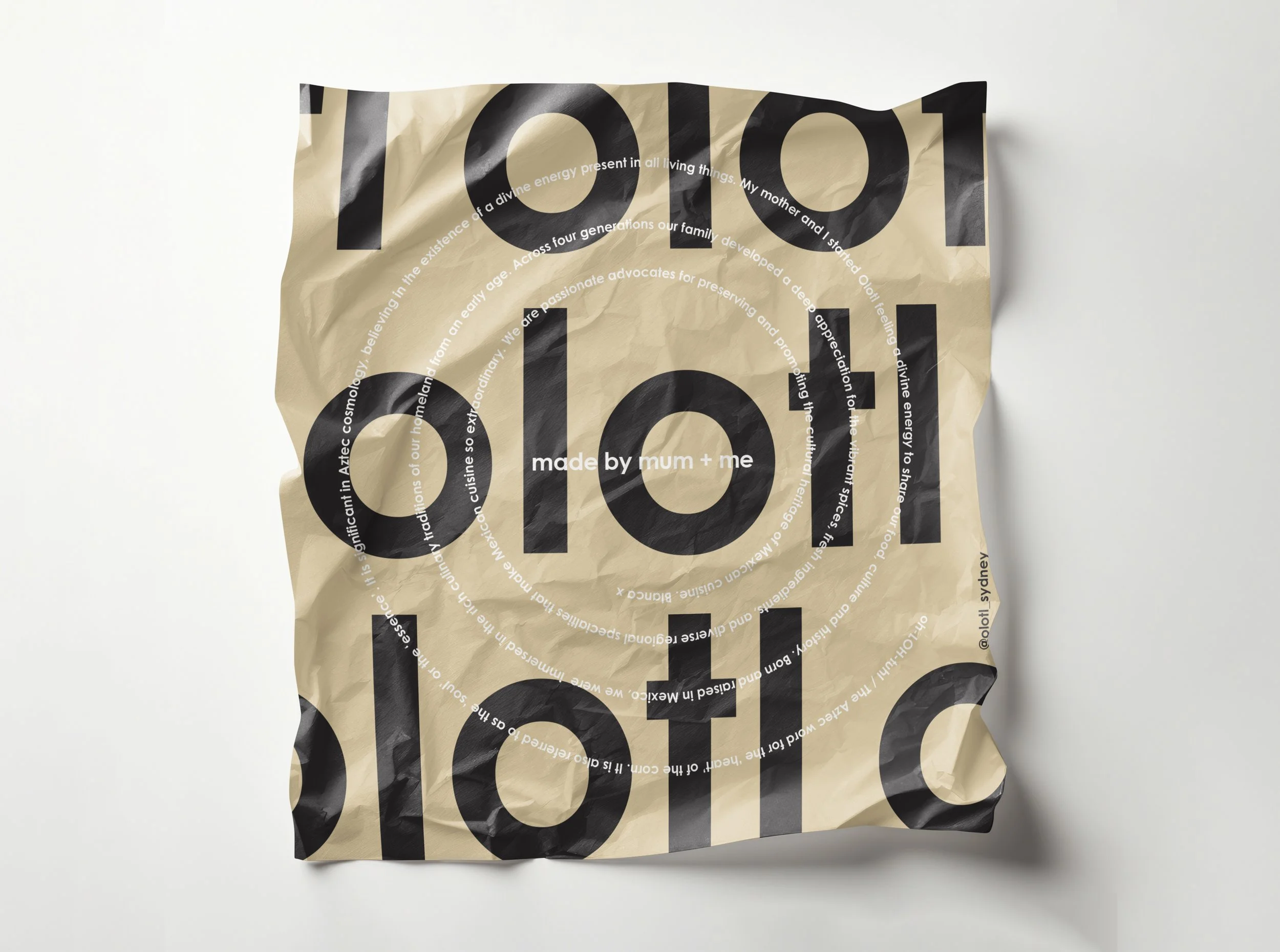
The first design features the Olotl story spiralled over the large graphic logo type. As the taco is eaten, the story is revealed, the spiral fitting the exact size of the taco itself. The packaging interacting with the customer.
The second celebrating the two passionate woman who have built this business together on their own and love to call their offering ‘taco therapy’.
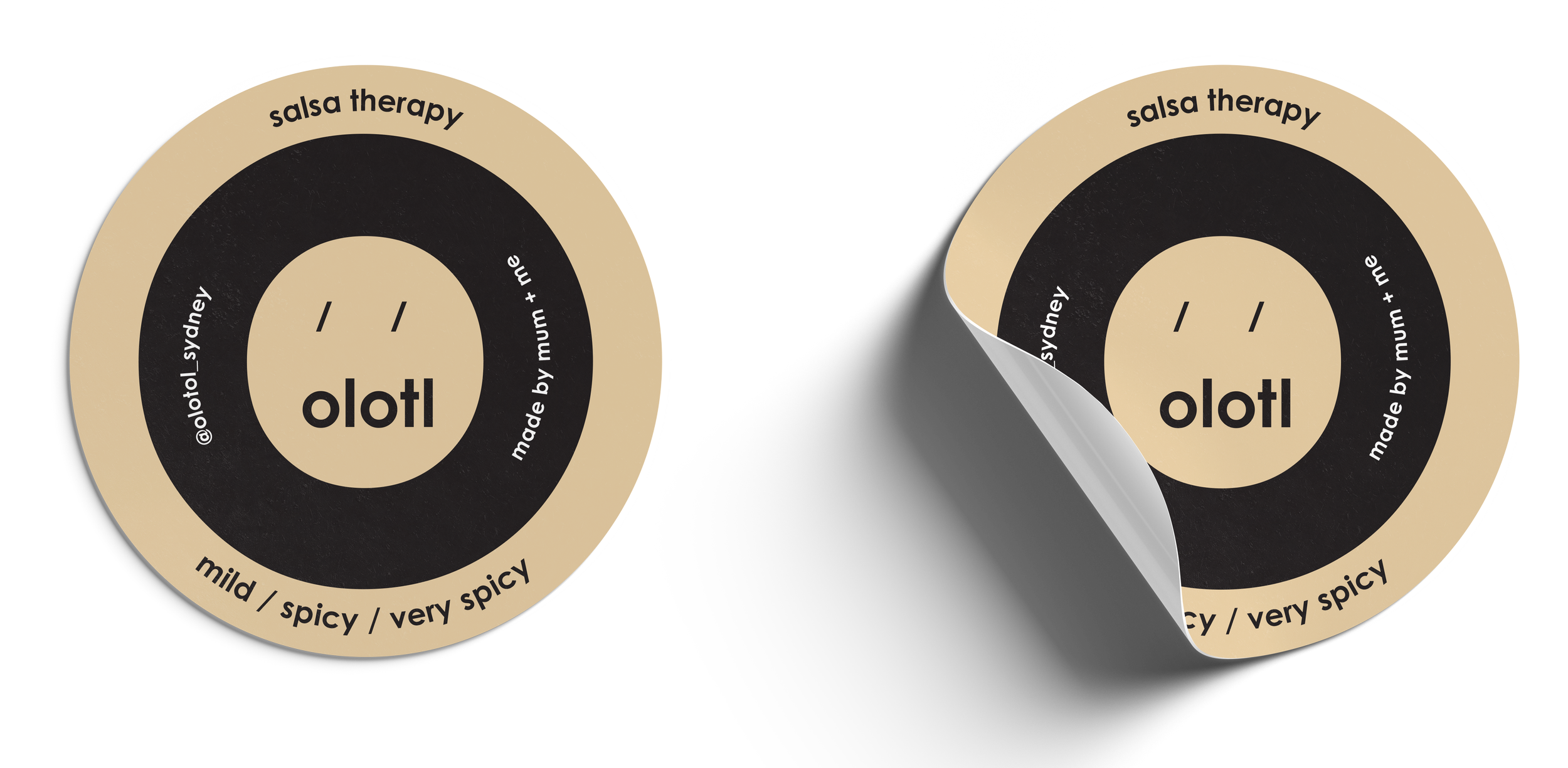
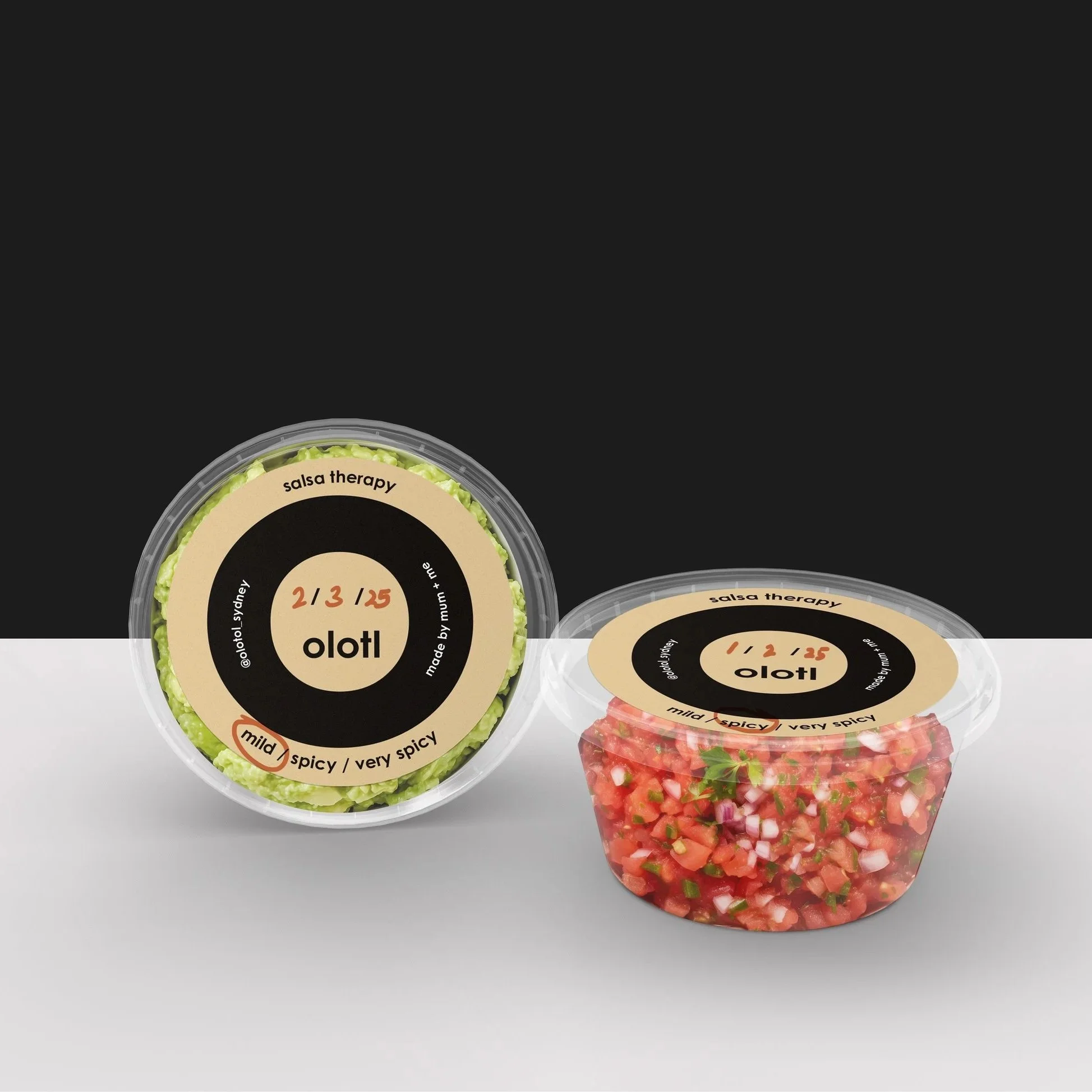
A simple parchment paper label was created to cover off all condiments with a simple system to circle the level of heat!
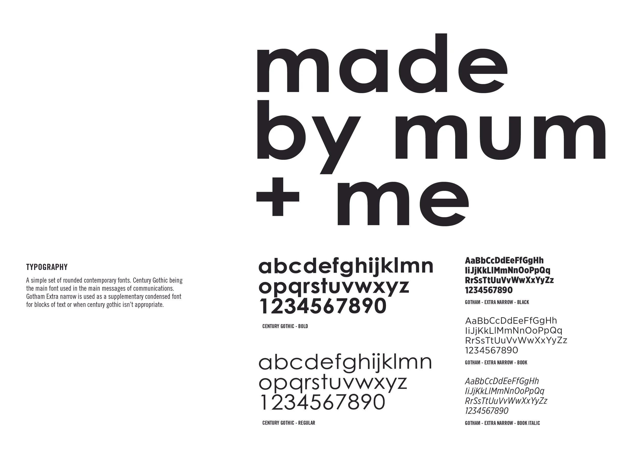
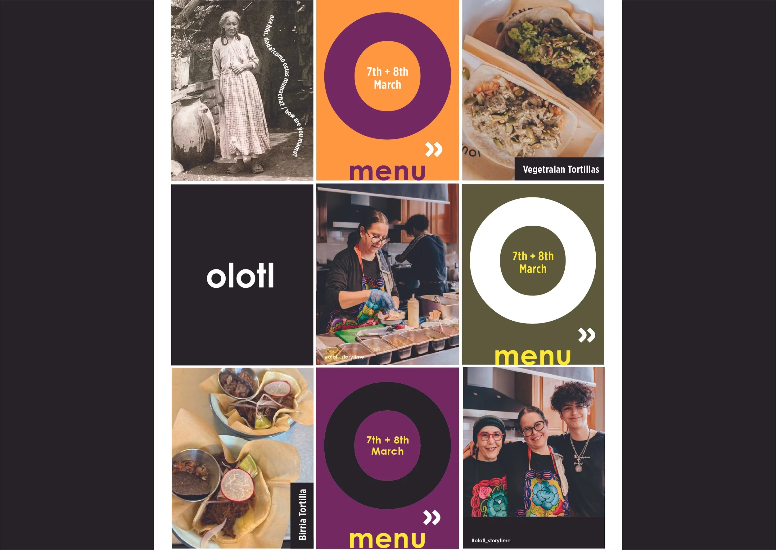
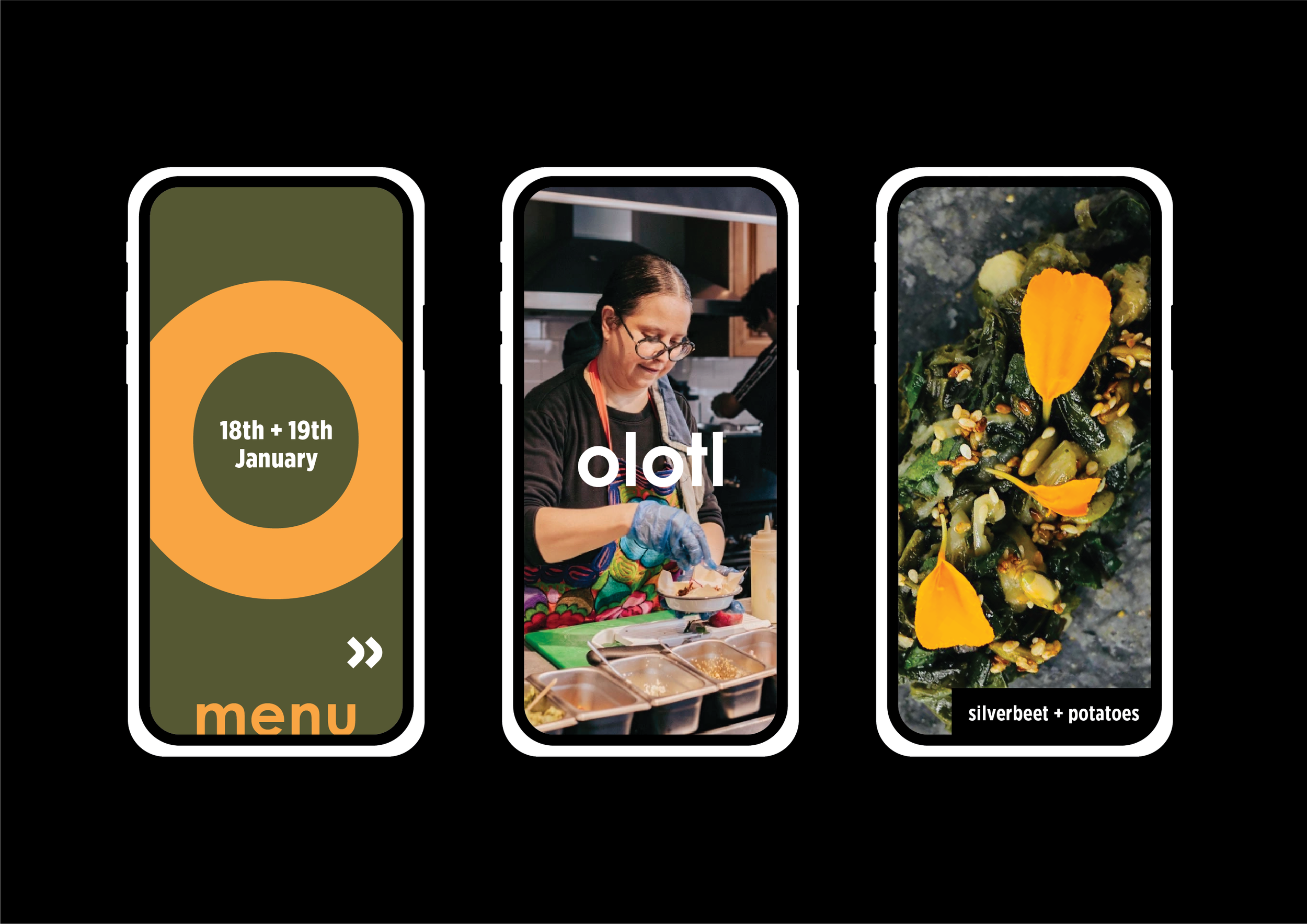
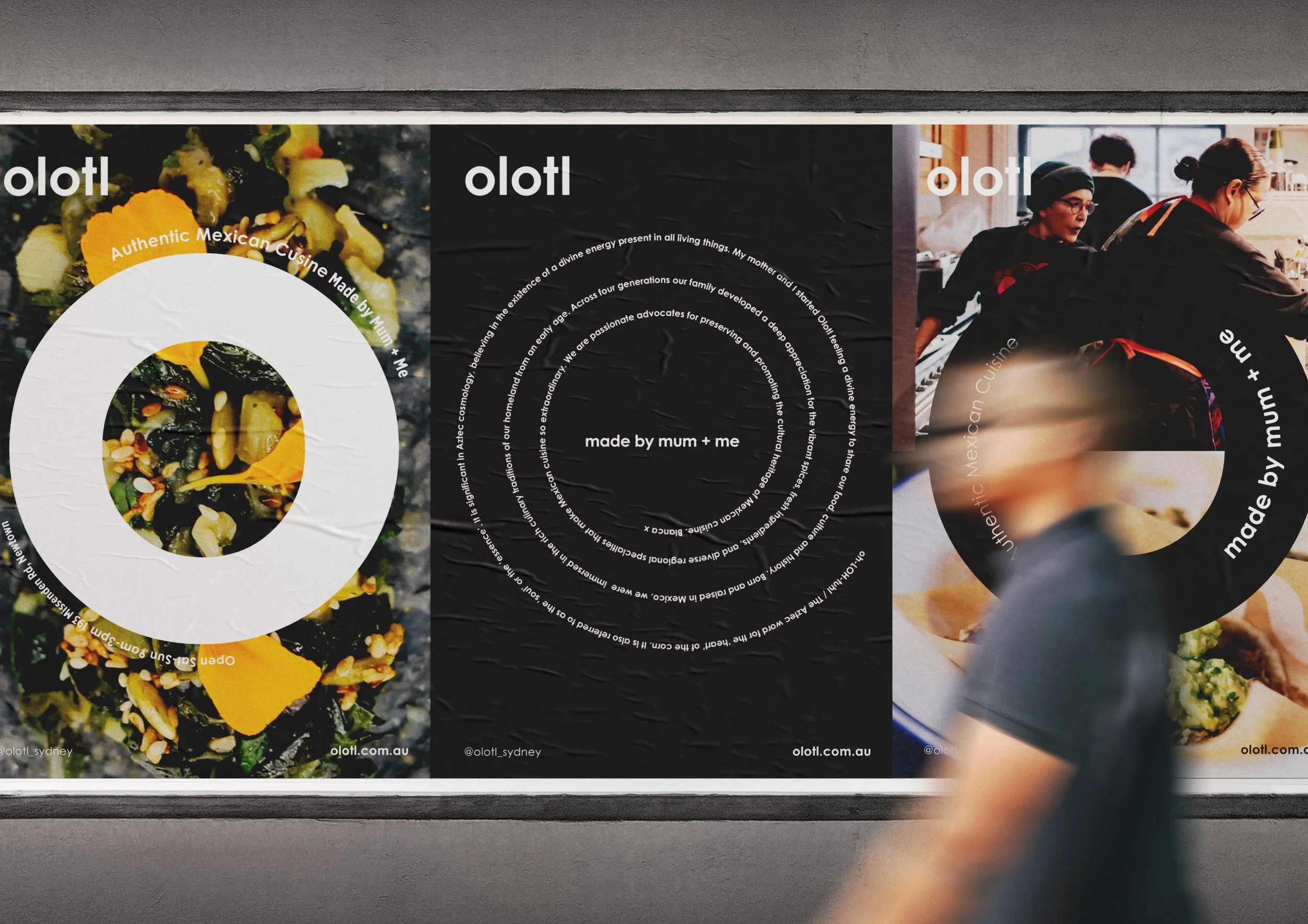
The ‘O’ from the brandmark is used across collateral as a graphic device representing family, tacos and community. The socials use a palette of four vibrant food inspired colours to add depth to the monotone brand.